
Pinto’s Market
An elevated health-focused grab-and-go experience
When Pinto Market approached Sansa Interiors for their newest location, their goal was to create a fresh, inviting space that reflected their evolving brand. Pinto Market was founded on a simple idea: healthy food should be just as convenient and accessible as traditional fast food. They provide customers with nutritious, grab-and-go options, proving that making a healthy choice doesn't have to mean sacrificing convenience or time.
Our design approach focused on translating these core brand values into the physical environment. Located within Toronto's busy PATH network, the space needed to make a strong first impression and stand out among the constant flow of commuters and pedestrians. Through carefully selected materials, natural textures, and thoughtfully integrated design features, the interior was crafted to communicate freshness, wellness, and quality from the moment customers walk by.
City: Toronto, Ontario
Property Size: 1,200 sq ft
Timeline: 6 Months
Budget: $350,000
Defining the Experience
As Pinto Market prepared to launch their newest location, they wanted the space to embody the evolution of their brand while remaining true to their core mission of making healthy food convenient and accessible. The goal was to create an environment that immediately communicated freshness, quality, and wellness to the thousands of commuters passing through Toronto's PATH network each day.
A key priority was strengthening the connection between the physical space and the Pinto Market brand. The client wanted to thoughtfully incorporate recognizable brand elements throughout the interior, creating a cohesive experience that customers would instantly associate with Pinto Market.
Beyond functionality, the vision was to create memorable moments that would capture attention and leave a lasting impression. The space needed to feel exciting, elevated, and worthy of conversation. Incorporating distinctive design features and visual focal points that would create a sense of discovery and encourage customers to engage with the brand.
To support this vision, the client sought a refreshed and elevated material palette that would distinguish the location from traditional grab-and-go food concepts. Through carefully selected finishes, textures, and architectural details, the design aimed to create a modern and sophisticated environment that reflected the quality of the products being offered while reinforcing Pinto Market's position as a fresh, health-conscious alternative in the fast-casual market.
Understanding the Existing Space
Although the unit was vacant when Pinto Market took possession, it was far from a blank canvas. The previous tenant had left behind existing millwork, equipment, and infrastructure that were tailored to a completely different operational model. Rather than supporting Pinto Market's vision, these elements created significant limitations and ultimately needed to be removed.
The most notable challenge was the existing layout. A large front service counter dominated the space, creating a traditional point-of-sale experience where customers would approach, order, and leave. This arrangement was fundamentally at odds with Pinto Market's business model, which encourages customers to browse, discover products, and engage with the offerings at their own pace. Creating this experience required a complete rethinking of the space, beginning with the removal of the existing millwork and associated utilities.
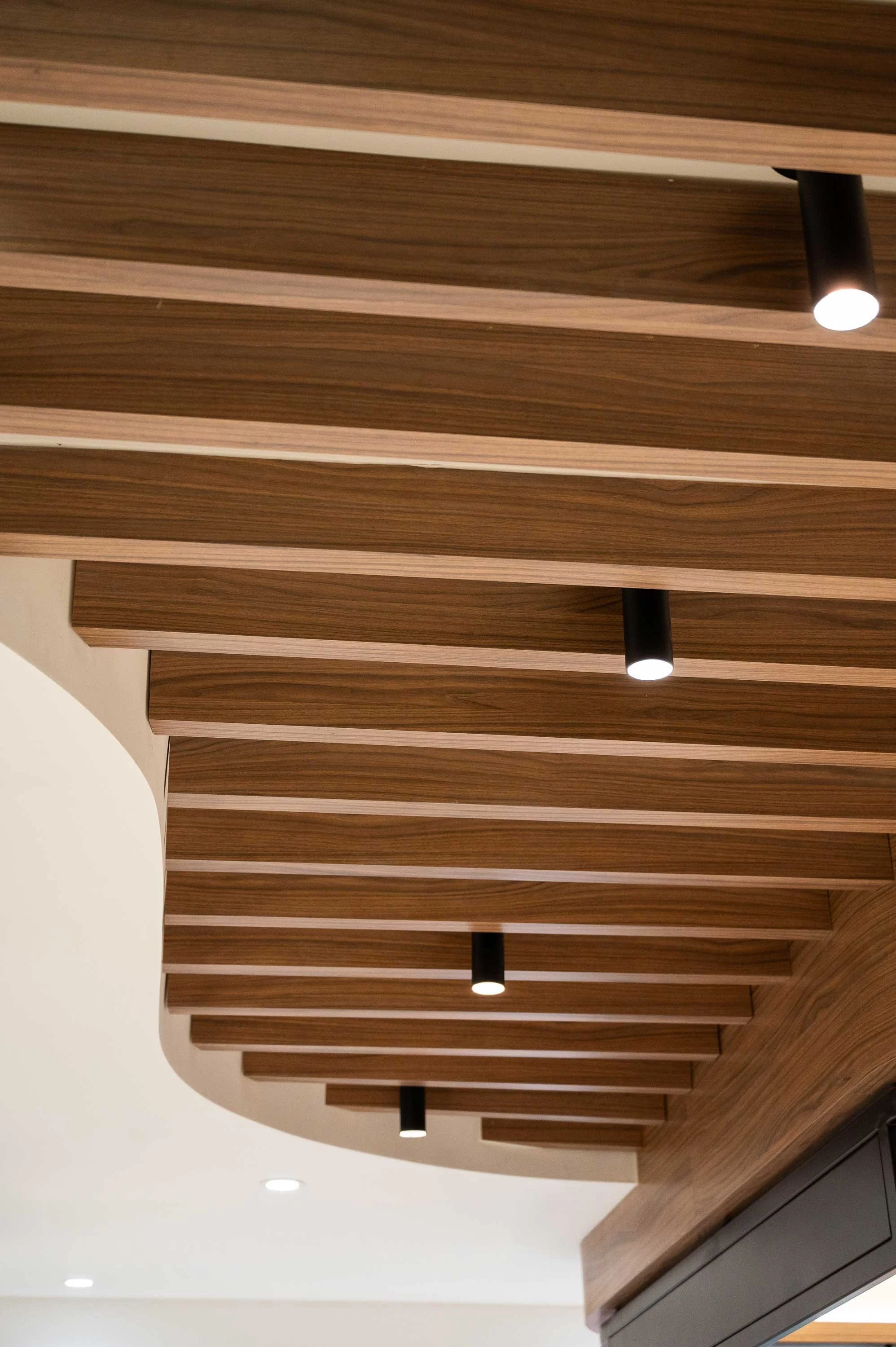
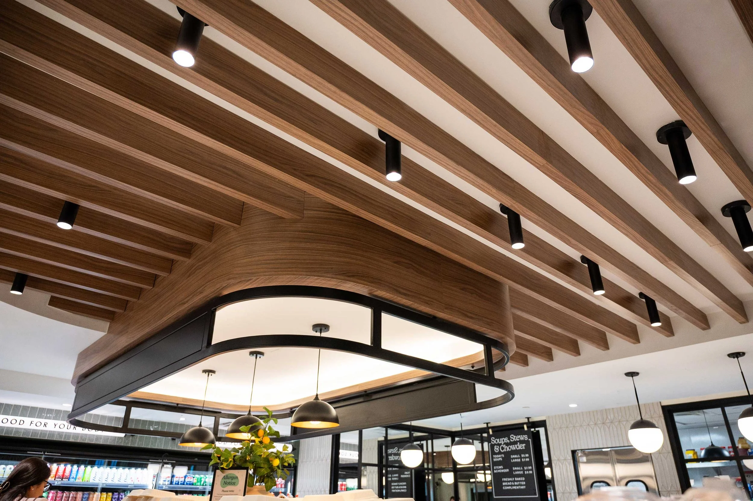
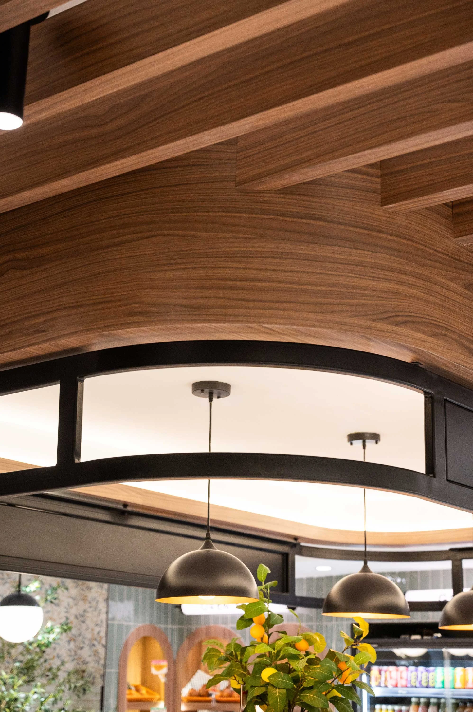
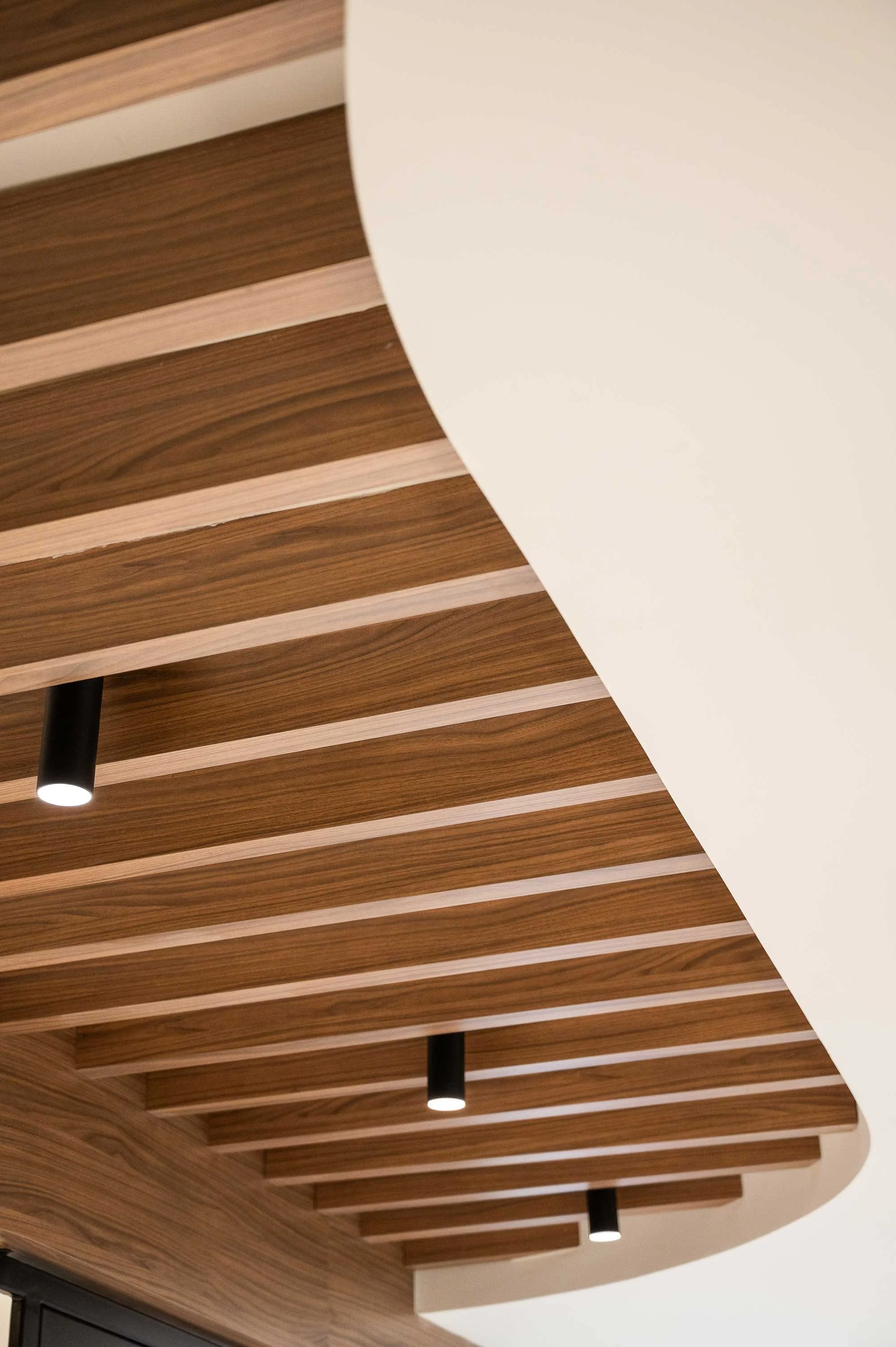
Beyond the remnants of the previous tenant, the shell itself presented unique design challenges. Located within Toronto's PATH network, the unit featured relatively low ceiling heights and limited opportunities to conceal building systems. Rather than viewing this as a constraint, the design team saw an opportunity to make the ceiling an intentional part of the overall design experience. Just as much attention was given to the ceiling plane as the floor plane, transforming a potential limitation into a defining design feature that would contribute to the character and identity of the space.
These existing conditions became the foundation for the design strategy, informing decisions that would ultimately transform the unit into a destination that reflected Pinto Market's fresh, health-conscious brand

Bringing the Vision to Life
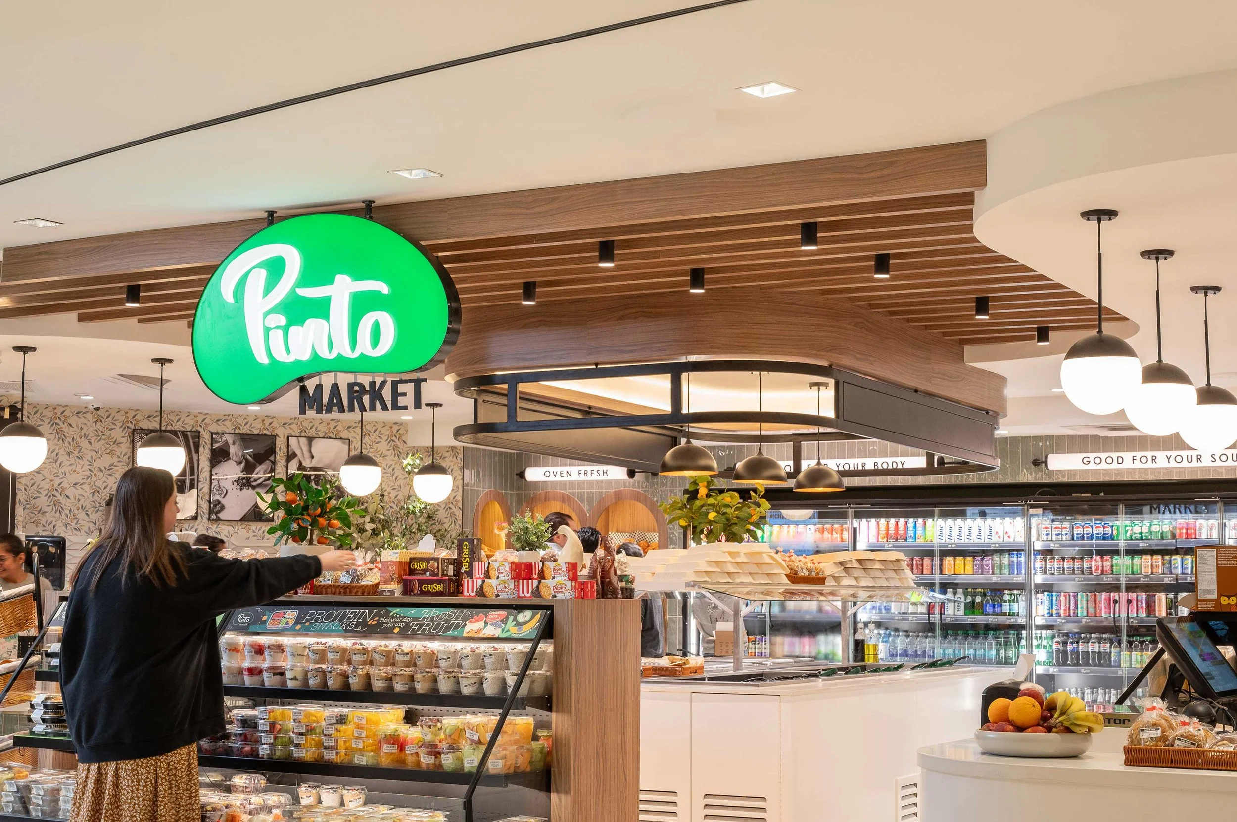
The design strategy centered on transforming a conventional retail unit into an immersive market experience that embodied Pinto Market's fresh, health-conscious brand. Rather than creating a space focused on a single transaction point, the goal was to encourage customers to enter, explore, and engage with the product offerings at their own pace.
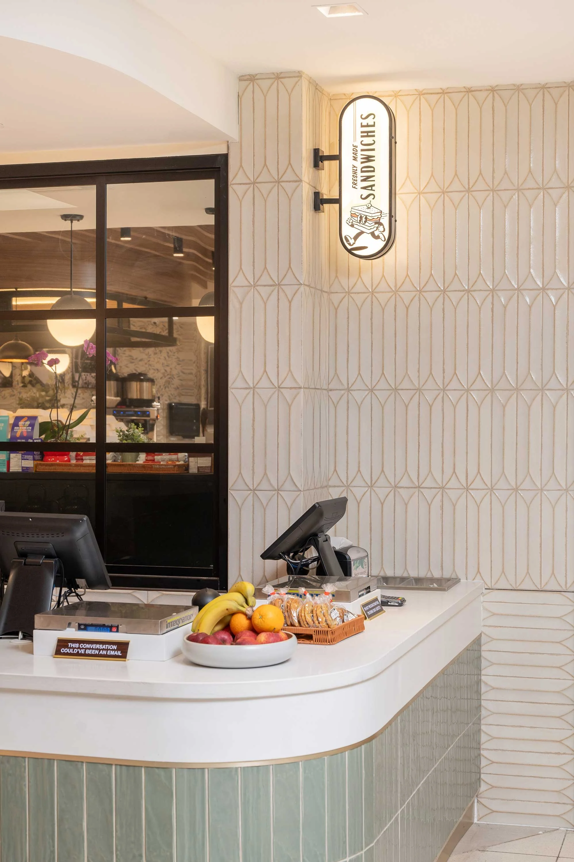
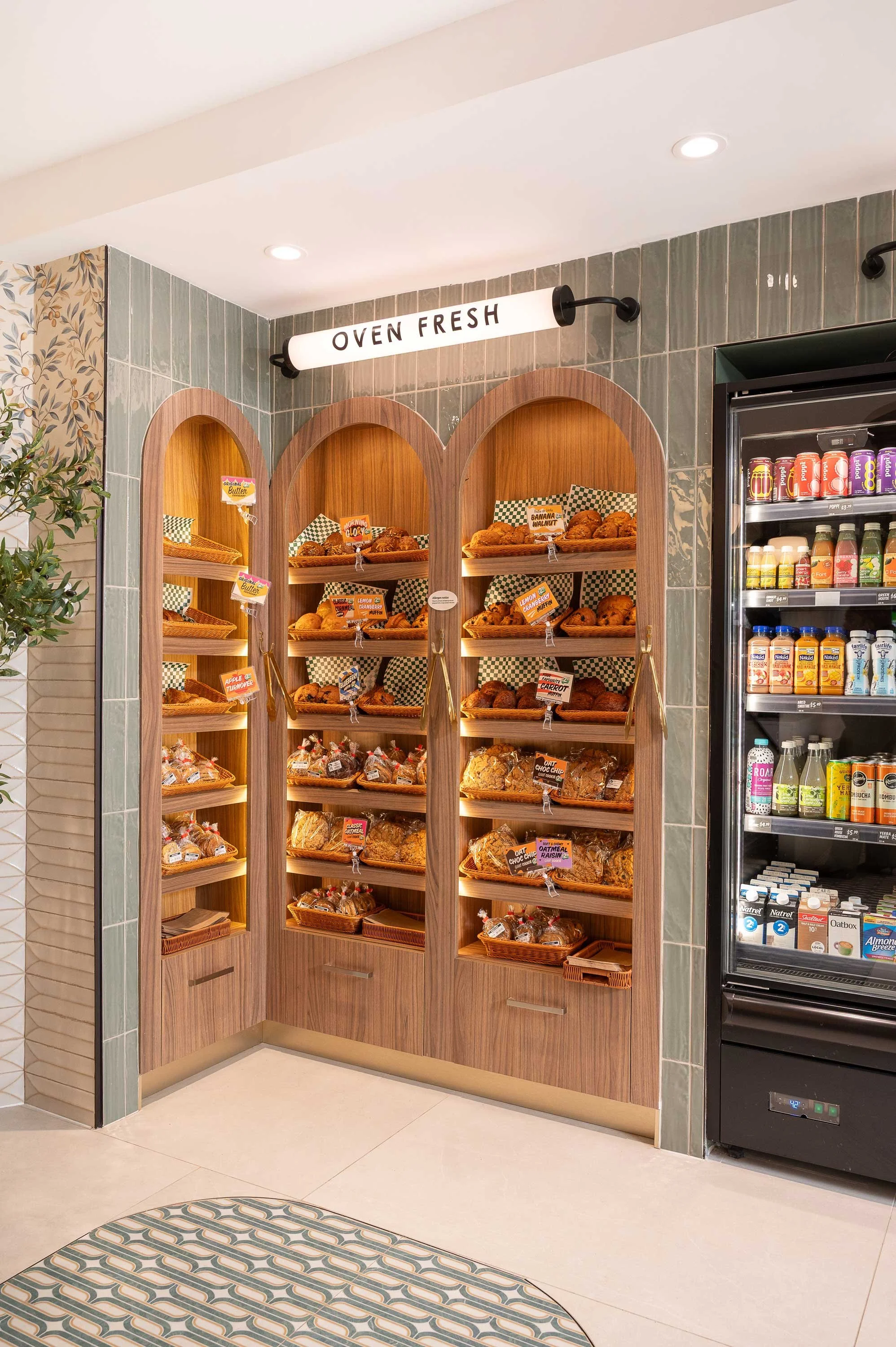
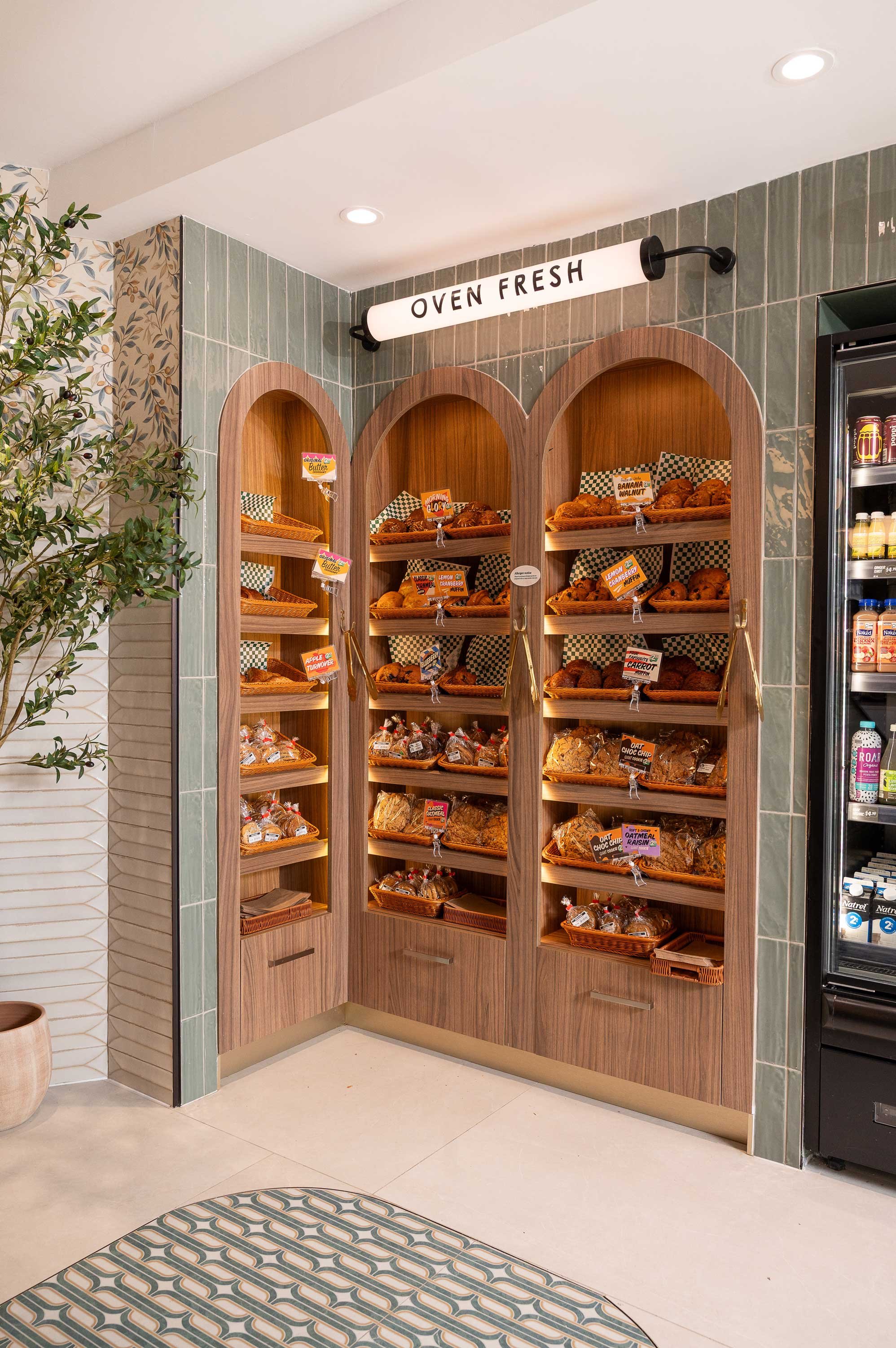
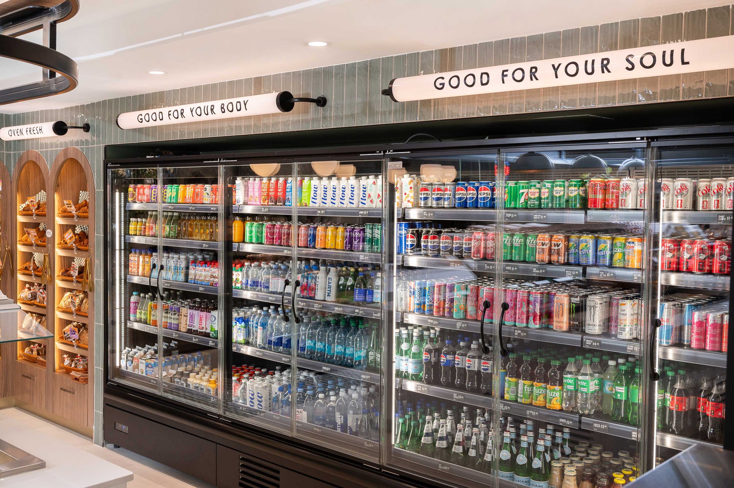
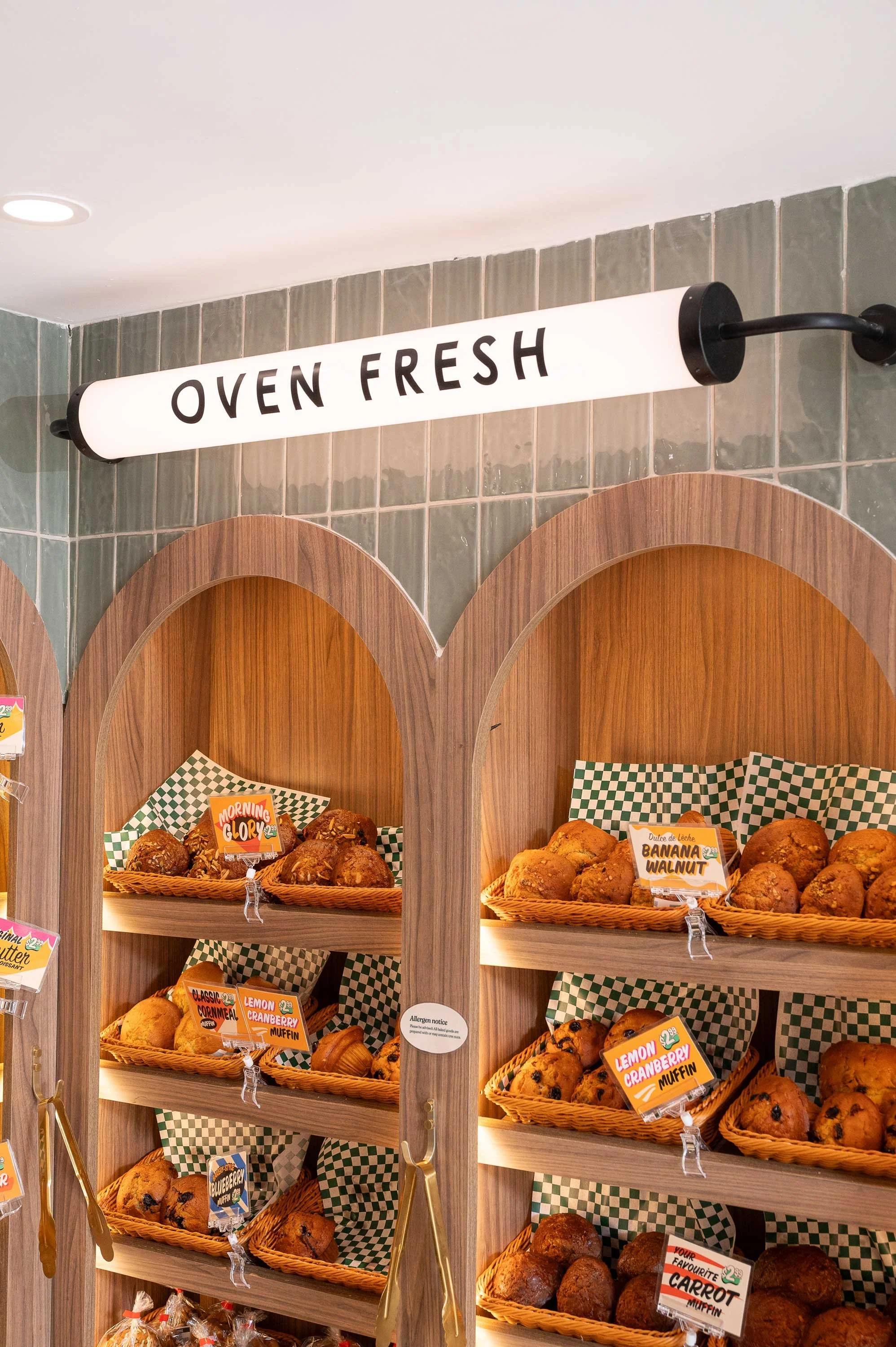
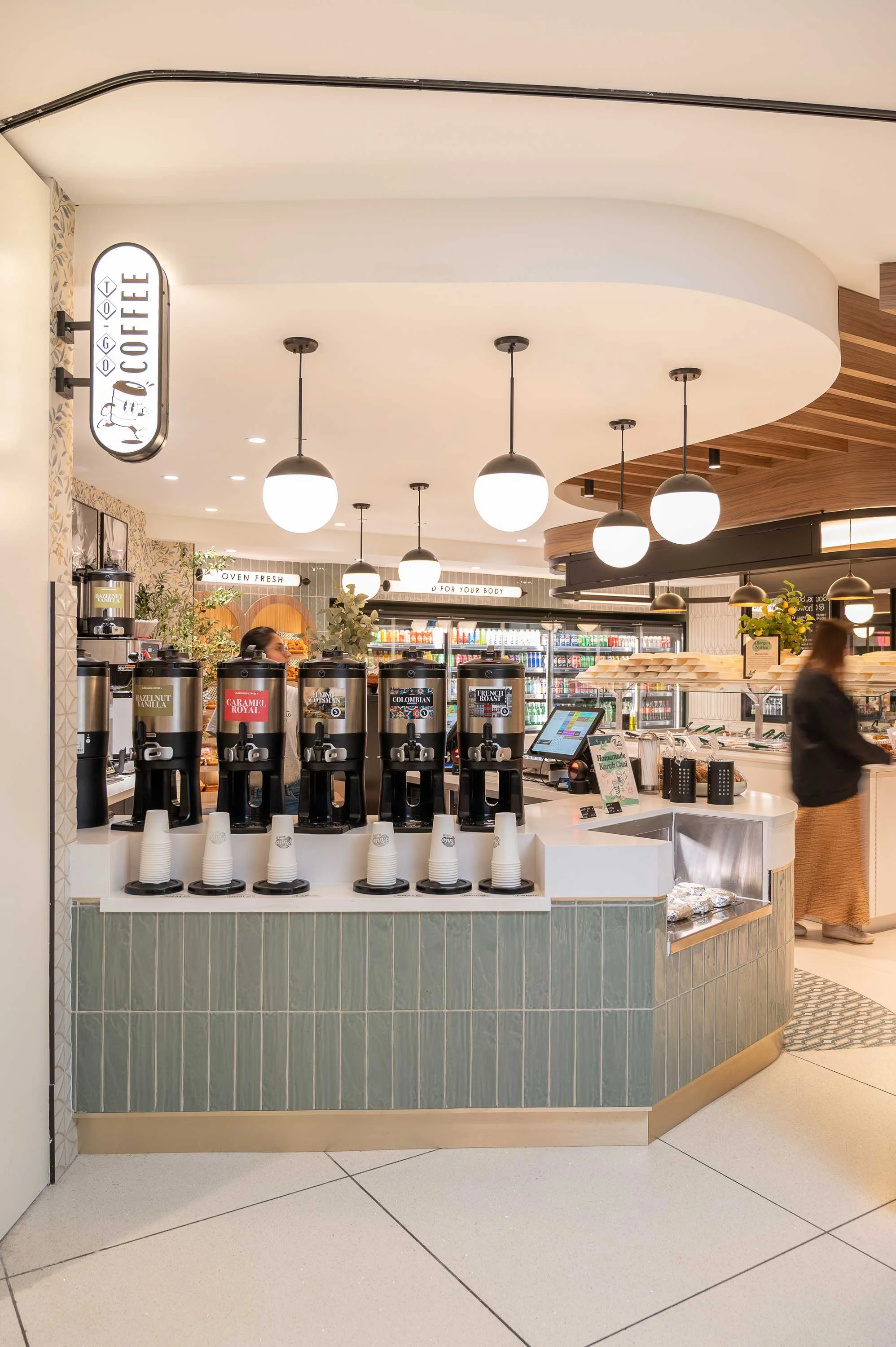
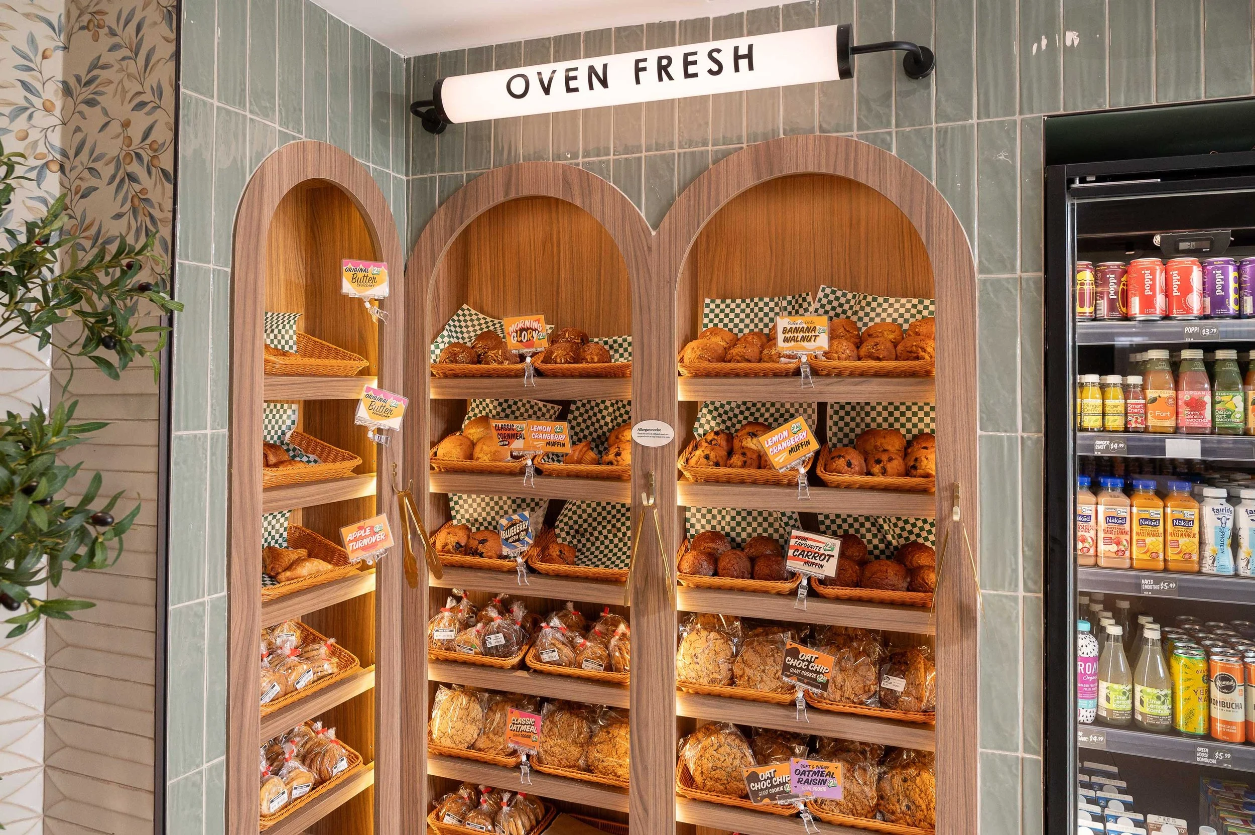
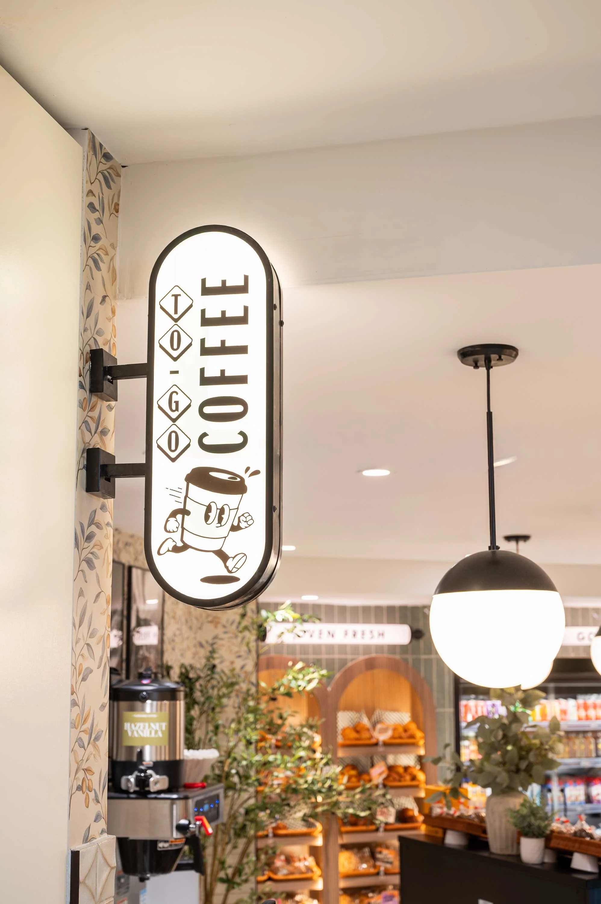
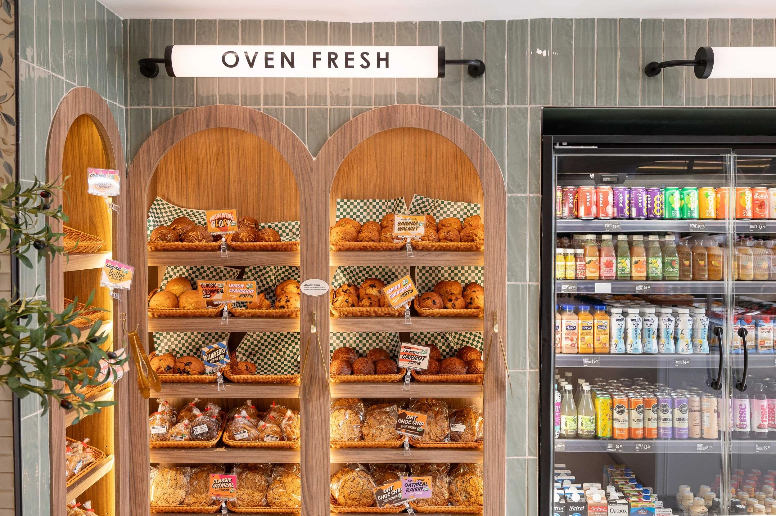
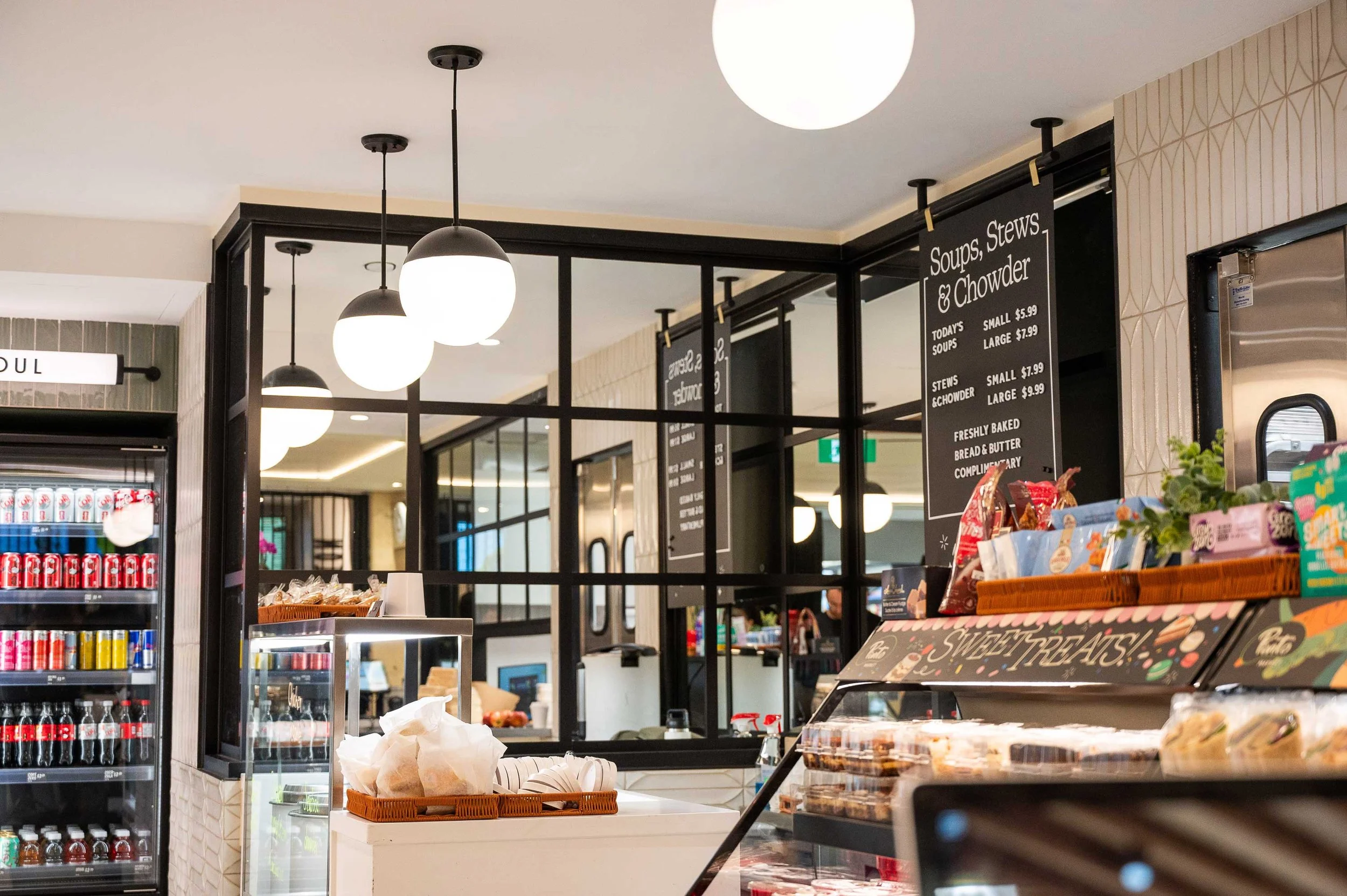
To achieve this, the design introduced a series of visual focal points throughout the space, creating moments of discovery that draw customers deeper into the market. From the illuminated signage throughout to the custom ceiling features and curated product displays, each element was designed to reinforce the brand while creating a memorable customer experience.
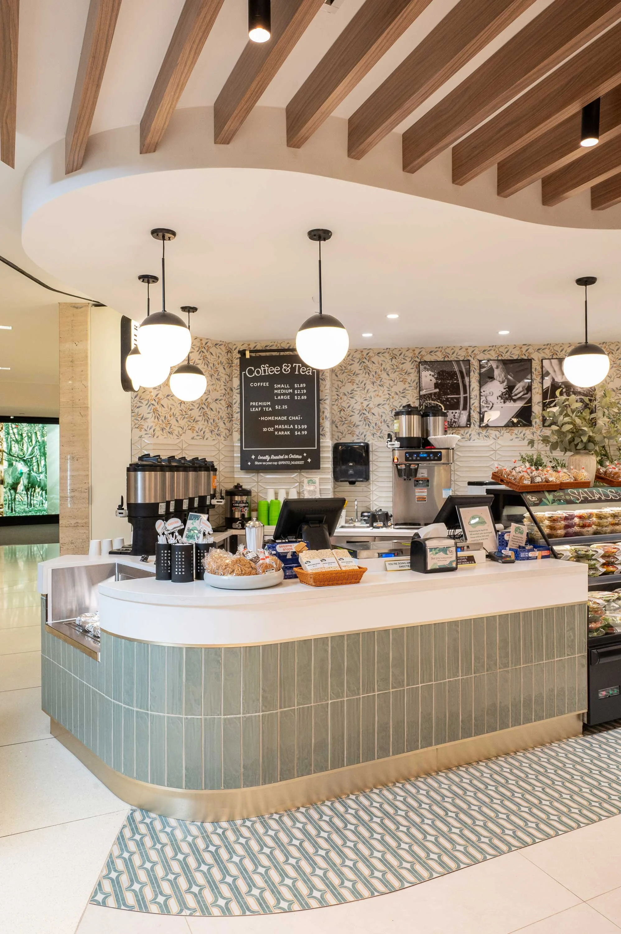
A key challenge was the unit's low ceiling height, a common constraint within Toronto's PATH network. Instead of attempting to hide this limitation, the design embraced the ceiling as a defining architectural feature. Sculptural curved bulkheads, warm wood slat detailing, and layered lighting were used to create rhythm, movement, and visual interest overhead, ensuring the ceiling plane became just as intentional and impactful as the floor below.
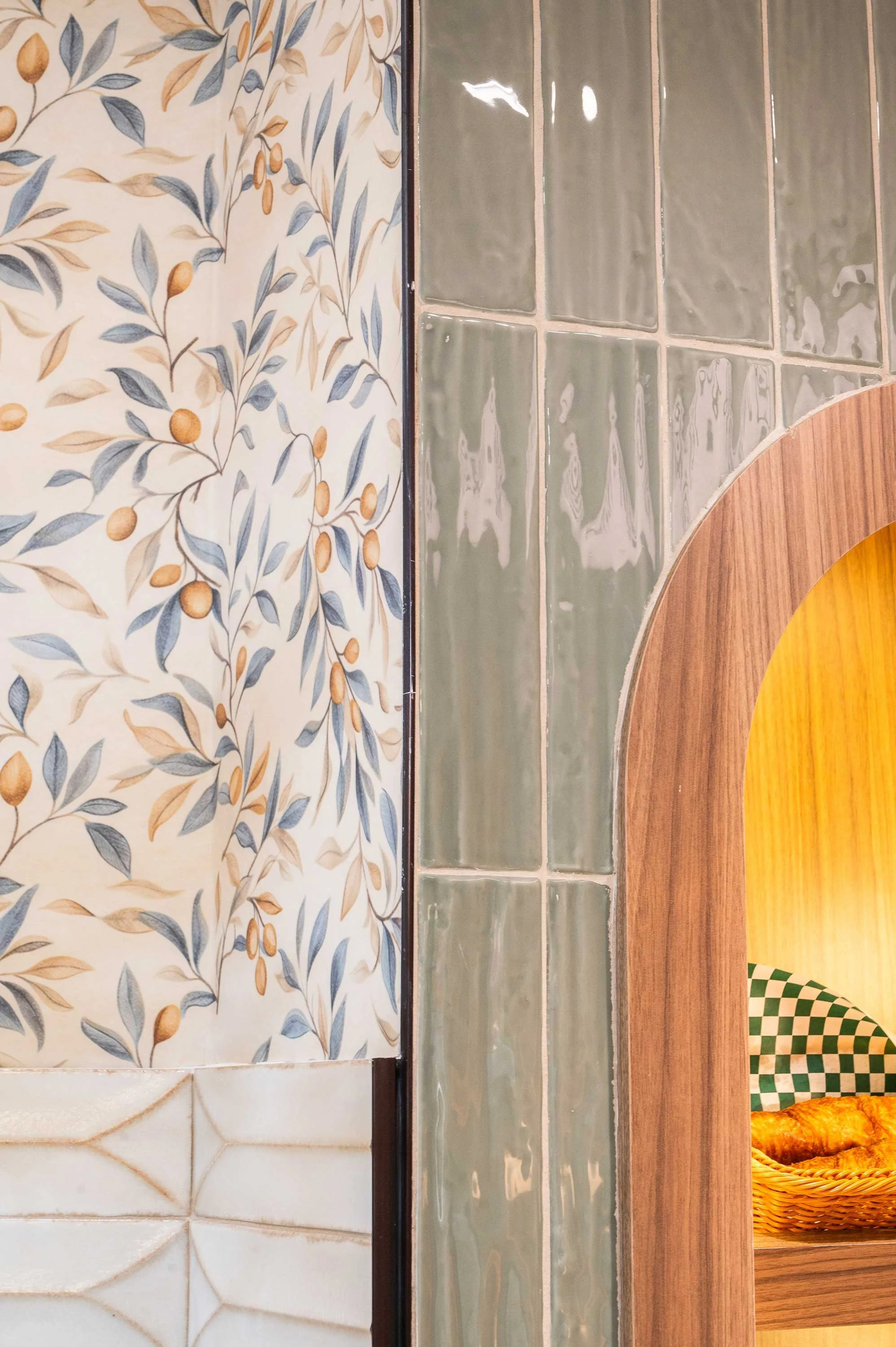
Material selection also played a significant role in the overall strategy. A refined palette of warm woods, soft greens, textured finishes, and natural-inspired materials was chosen to reflect the freshness and quality associated with Pinto Market's products. These elements work together to create an environment that feels welcoming, elevated, and distinctly connected to the brand's mission of making healthy choices both accessible and enjoyable.
Sculptural Ceiling
One of the most defining elements of the space is the sculptural ceiling treatment. In response to the low ceiling height typical of Toronto’s PATH network, a series of curved forms and softened transitions were introduced to reduce the sense of compression and create visual movement overhead. Rather than treating the ceiling as a limitation, it was designed as a primary architectural feature that helps organize and elevate the entire space.
The layered ceiling geometry introduces a sense of flow and rhythm, subtly guiding customers through the interior while reinforcing key zones within the market.
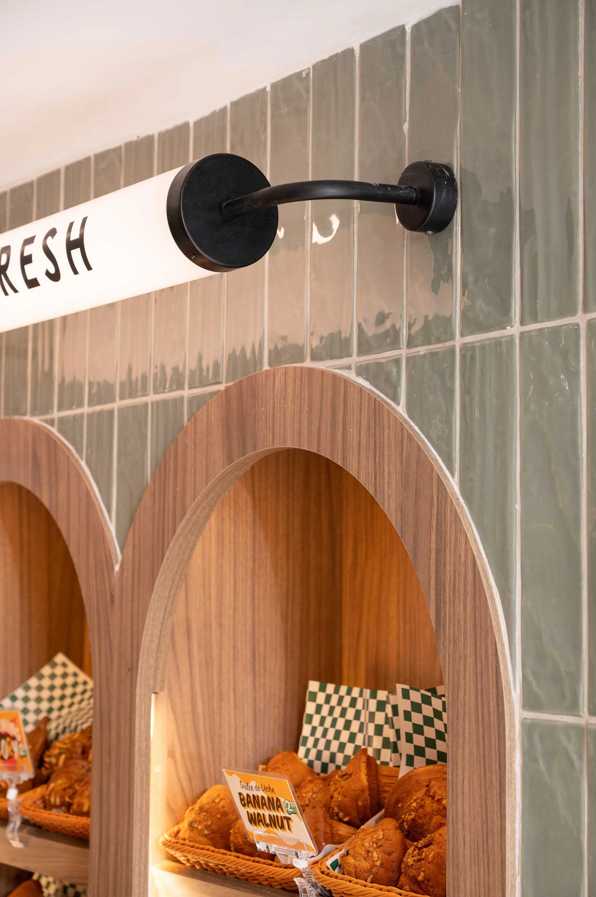
Integrated wood slat detailing adds warmth and texture while helping to visually break up the ceiling plane. The linear rhythm of the slats contrasts with the softer curved forms, creating balance and depth overhead. This feature also contributes to the overall brand direction, reinforcing a natural, fresh material language that aligns with Pinto Market’s identity.
Materials that Tell the Brand Story
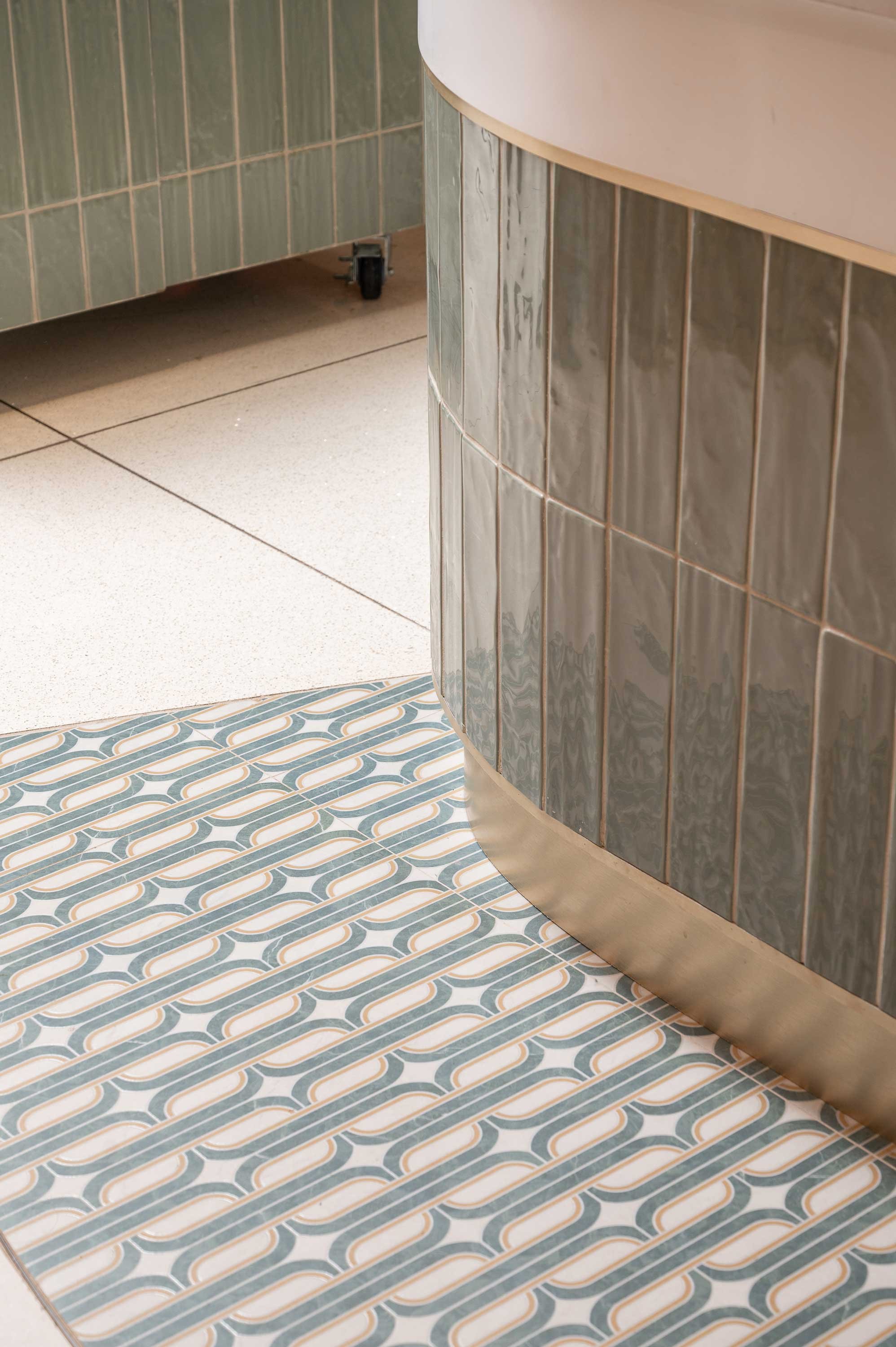
The material palette was carefully developed to create a layered, cohesive environment that reflects Pinto Market’s focus on freshness, quality, and approachability. Rather than relying on a single dominant material, the design combines multiple finishes that work together to create depth, warmth, and visual interest throughout the space.
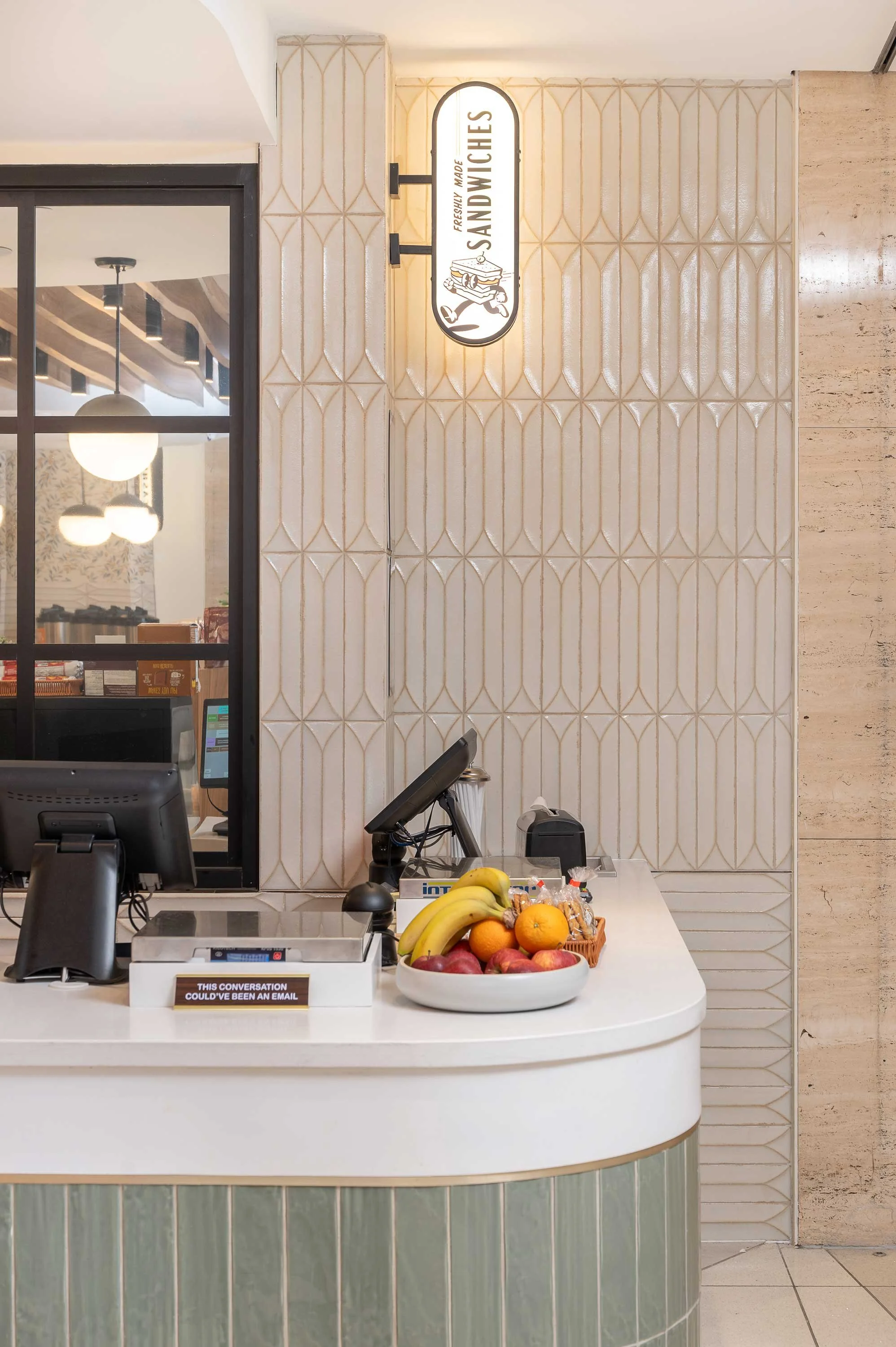
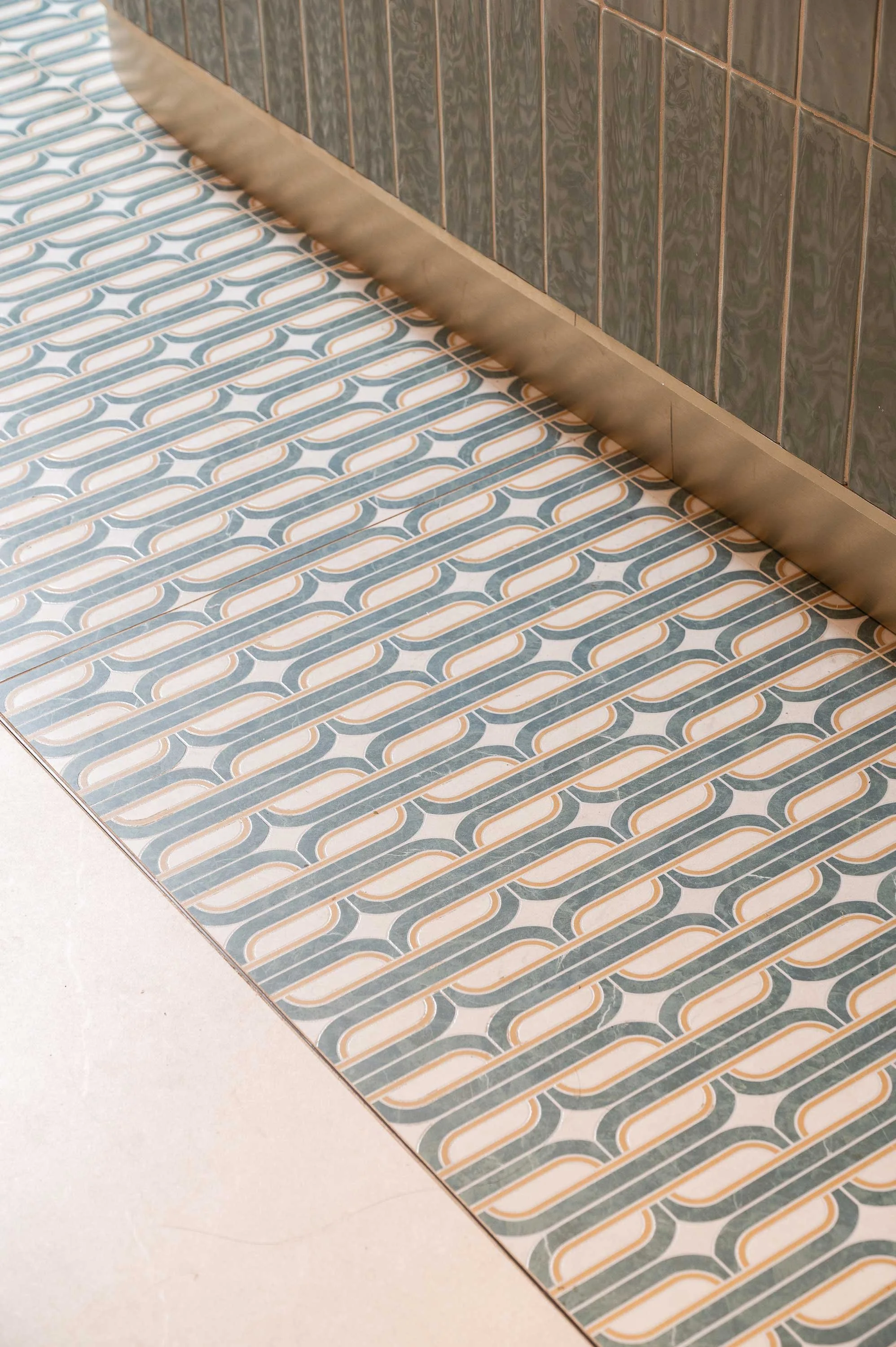
A key feature of the palette is the use of varied tiles, introduced across flooring, feature walls, and select millwork applications. These tiles range in tone, texture, and pattern, creating subtle shifts in colour and surface quality as customers move through the space. This variation adds a handcrafted, almost organic quality to the interior, reinforcing the brand’s connection to natural, healthy food while elevating the overall visual experience.
Balancing the cooler tile palette, warm wood tones were introduced throughout the ceiling feature and extended into key display elements and architectural detailing. The wood slat ceiling installation in particular plays a defining role in softening the space, bringing warmth overhead while adding rhythm and direction. This continuity of wood across ceiling and fixtures helps unify the environment and creates a more cohesive, intentionally designed experience.
To ground the palette and add contrast, matte black accents were incorporated throughout lighting, metal framing, and select details. These darker elements provide visual punctuation within the space, helping define edges, highlight focal points, and add a subtle industrial edge. Rather than feeling harsh, the black finishes were carefully balanced to enhance clarity and give the space a refined sense of structure.
Together, these materials work in harmony to create a space that feels elevated yet approachable. The result is an interior that is visually rich without feeling overwhelming, supporting the customer experience while reinforcing Pinto Market’s modern, health-forward identity.

Overcoming Project Constraints

Adapting to a Non-Traditional Start
One of the primary challenges on this project was our stage of involvement. Sansa Interiors was brought into the process partway through, after certain elements of the project had already been developed. While it is always ideal to engage the interior design team from the earliest stages, this is not always how projects unfold.
As a result, our team undertook a comprehensive review of the existing work to fully understand the design direction, constraints, and decisions already in place. From there, we adapted our typical process to work within these parameters while still ensuring the client’s vision could be fully realized.
This required a careful balance of respecting prior work while strategically refining and enhancing the design. Internally, we adjusted our workflow to maintain efficiency, ensuring that decisions, coordination, and revisions were managed in a way that kept the project progressing smoothly despite the non-linear start.
Fast-Tracked Design & Coordination
The project was also subject to a highly compressed timeline, further intensified by the fact that we were introduced later in the process. Key milestones, including the landlord fixturing period, had to be met without delay, leaving little flexibility in scheduling.
To meet these demands, our team expanded resources and implemented a highly structured coordination approach. Meetings, approvals, and design milestones were pre-scheduled to ensure all stakeholders remained aligned and decisions could be made quickly and efficiently.
This accelerated timeline extended beyond design and into construction, requiring close collaboration with the contractor and suppliers. Material selections needed to consider availability, lead times, and substitutions where necessary. This introduced an additional layer of complexity, as materiality was a fundamental driver of the overall design intent, and any substitutions had the potential to significantly impact the final aesthetic. Through close coordination and rapid problem-solving, we were able to maintain design integrity while keeping the project on schedule.
Reimagining the Ceiling Plane
A defining spatial challenge of the project was the low ceiling height, a common condition within Toronto’s PATH network. While this constraint initially limited vertical openness, it ultimately became a key driver of the design approach.
Rather than attempting to conceal or minimize the ceiling condition, the design embraced it as an opportunity for creative expression. Through sculptural forms, layered materials, and integrated lighting strategies, the ceiling was transformed into a dynamic architectural feature.
This approach shifted the perception of the space, turning what could have been a limitation into one of its most distinctive and memorable design elements. The result is a ceiling plane that feels intentional, engaging, and integral to the overall spatial experience.

The End Result
The completed Pinto Market location successfully transforms a compact retail unit into a vibrant, experiential space that reflects the brand’s core values of health, freshness, and convenience. Through a carefully considered combination of materiality, spatial storytelling, and architectural detailing, the design elevates the everyday grab-and-go experience into something more engaging and memorable.
Despite significant constraints, the final outcome delivers a cohesive and highly intentional environment. What began as a standard commercial unit has been reimagined into a destination that encourages exploration, reinforces brand identity, and supports a more dynamic customer journey.
The result is a space that not only meets the functional demands of a fast-paced retail operation but also strengthens Pinto Market’s presence within a highly competitive urban context. Every design decision works together to create a refined yet approachable atmosphere, leaving customers with a lasting impression of a brand that prioritizes both quality and experience.
Team of Consultants & Local Partners:
Toronto Interior Design: Sansa Interiors
Lighting: Kohara + Co
Photography: Luke Cleland
Feeling Inspired?
If you're looking for a restaurant and hospitality interior design team, you have come to the right place!
Contact us and let our team of interior designers support you.
Sansa Interiors Inc.
Toronto, Canada
info@sansainteriors.com
(647) 556-3137