Light-Filled Interiors with Warm, Minimalist Design
This project set out to completely transform a dark, dated home into one that feels bright, fresh, and effortlessly relaxing. Our client wanted a modern update but was careful to avoid a look that felt cold or lifeless. With that in mind, our design direction focused on balance, infusing the space with character and warmth while maintaining a clean, contemporary aesthetic. Every detail, from the material palette to the millwork profiles, was chosen to bring a sense of lightness and comfort, creating a home that feels both rejuvenated and timeless.
City: Toronto
Property Size: 2500sqft
Timeline: 10 months
Budget: $800k

The Palette
When we first assessed the existing space, it was clear that a dramatic transformation was needed to align with our client’s vision. We wanted to create a palette that would completely lift the atmosphere, something bright, inviting, and full of warmth. We chose a soft off-white as the primary colour throughout the home, complemented by accents of a deeper beige to add subtle depth without feeling stark or heavy.
To further enhance the sense of warmth, we introduced white oak flooring and cabinetry on the main level, creating a natural connection between spaces and a calm, cohesive flow. Upstairs, we layered in a slightly darker wood tone and black accents to add contrast and visual interest while maintaining balance within the overall palette.
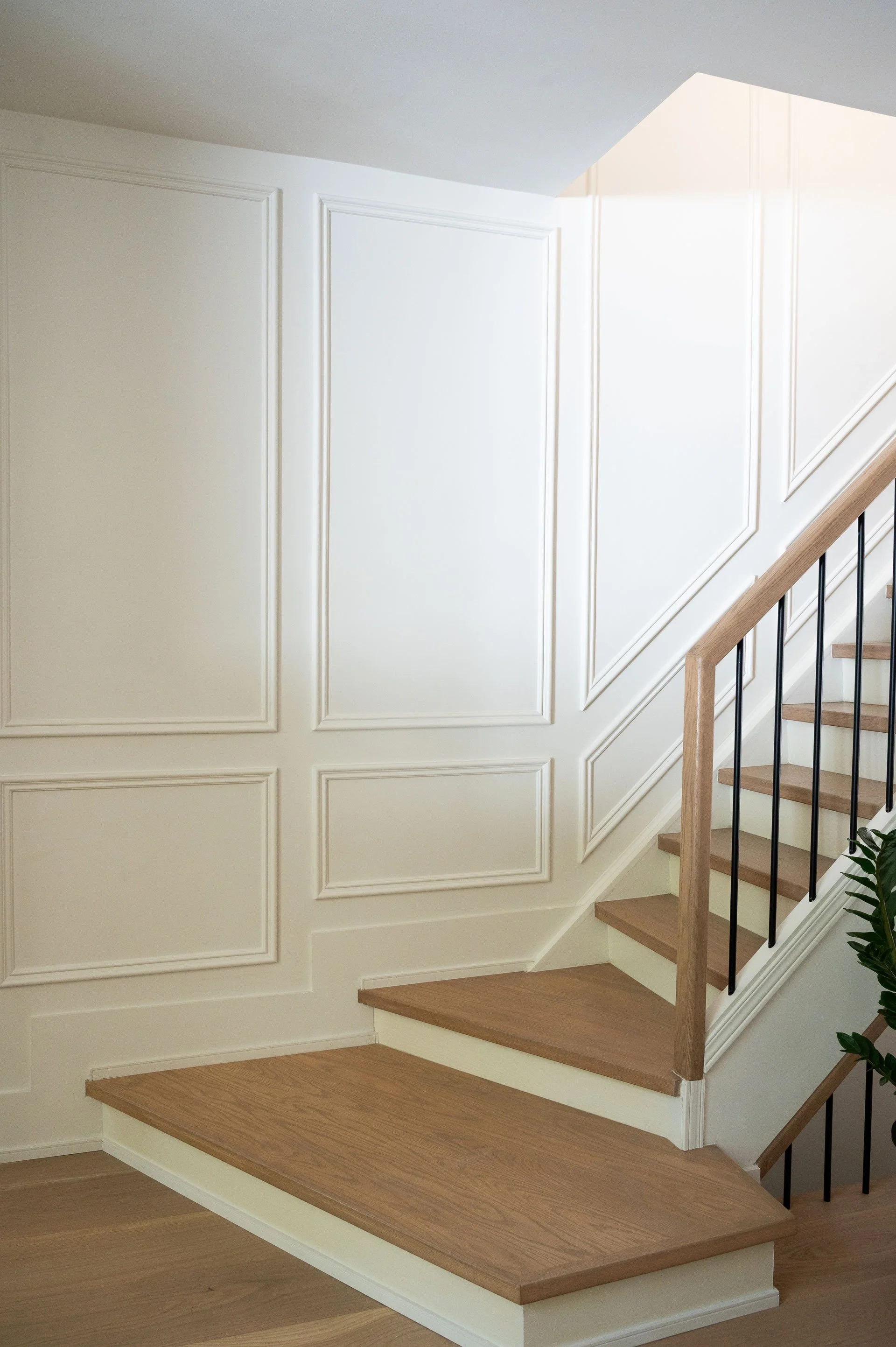
The staircase structure remained in its original location, but it received a complete facelift. We removed the old glass railing and carpeted steps, replacing them with light oak treads that coordinate seamlessly with the home’s flooring. A sleek wood handrail paired with black tubular spindles gives the stairs a modern, airy feel. Despite maintaining the same narrow width, this updated design makes the staircase feel noticeably more open and visually lighter, enhancing the flow of the surrounding spaces.
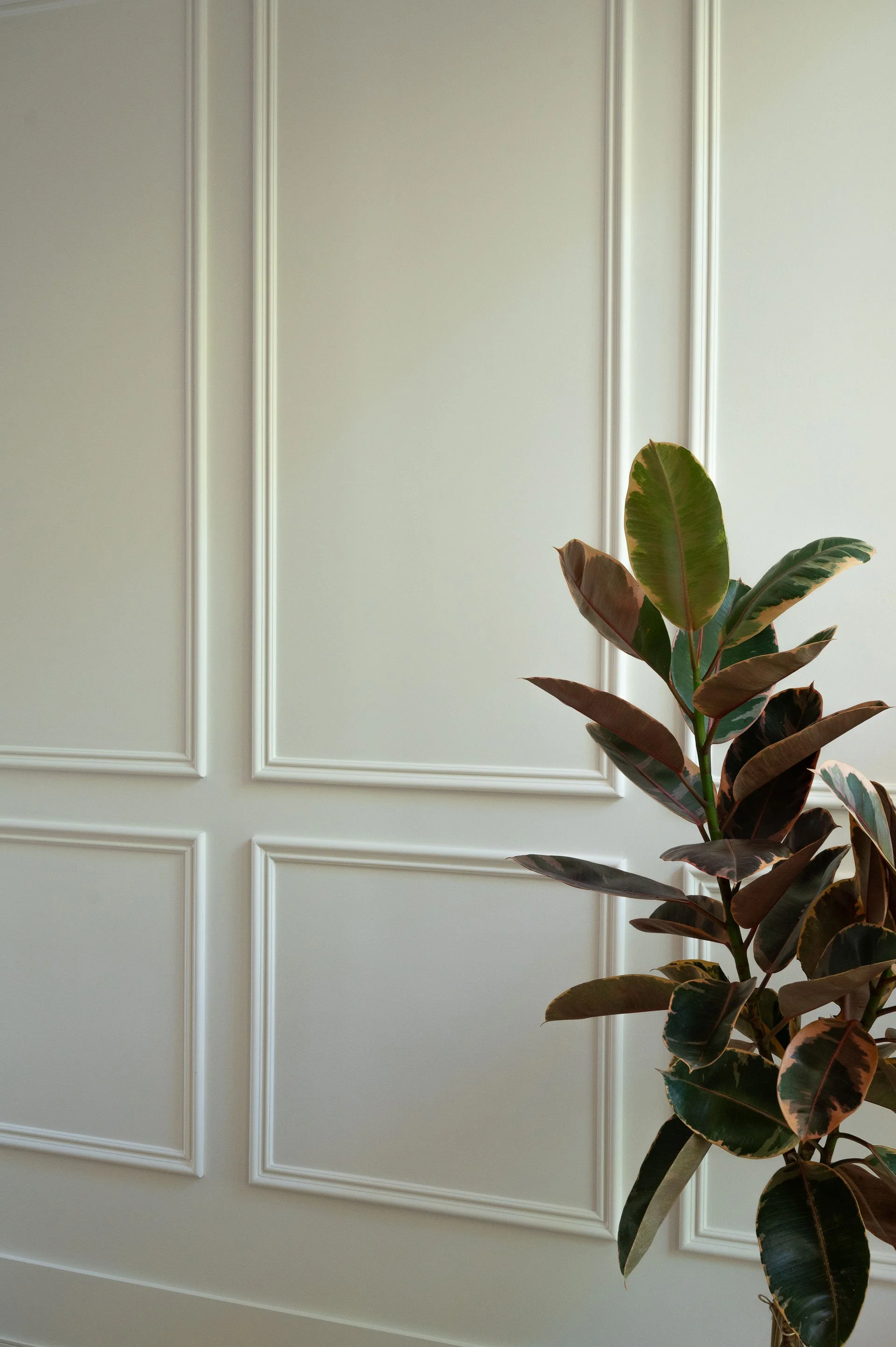
To add subtle architectural interest without overwhelming the home’s clean aesthetic, we introduced decorative wall molding on some of the larger wall expanses. The client wanted something understated rather than bold or ornate—a design choice that adds texture and depth while providing a versatile backdrop for future art or decorative pieces. The result is a staircase that feels contemporary, refined, and thoughtfully integrated into the overall design of the home.
The Subtle Statement
Where Light Lives
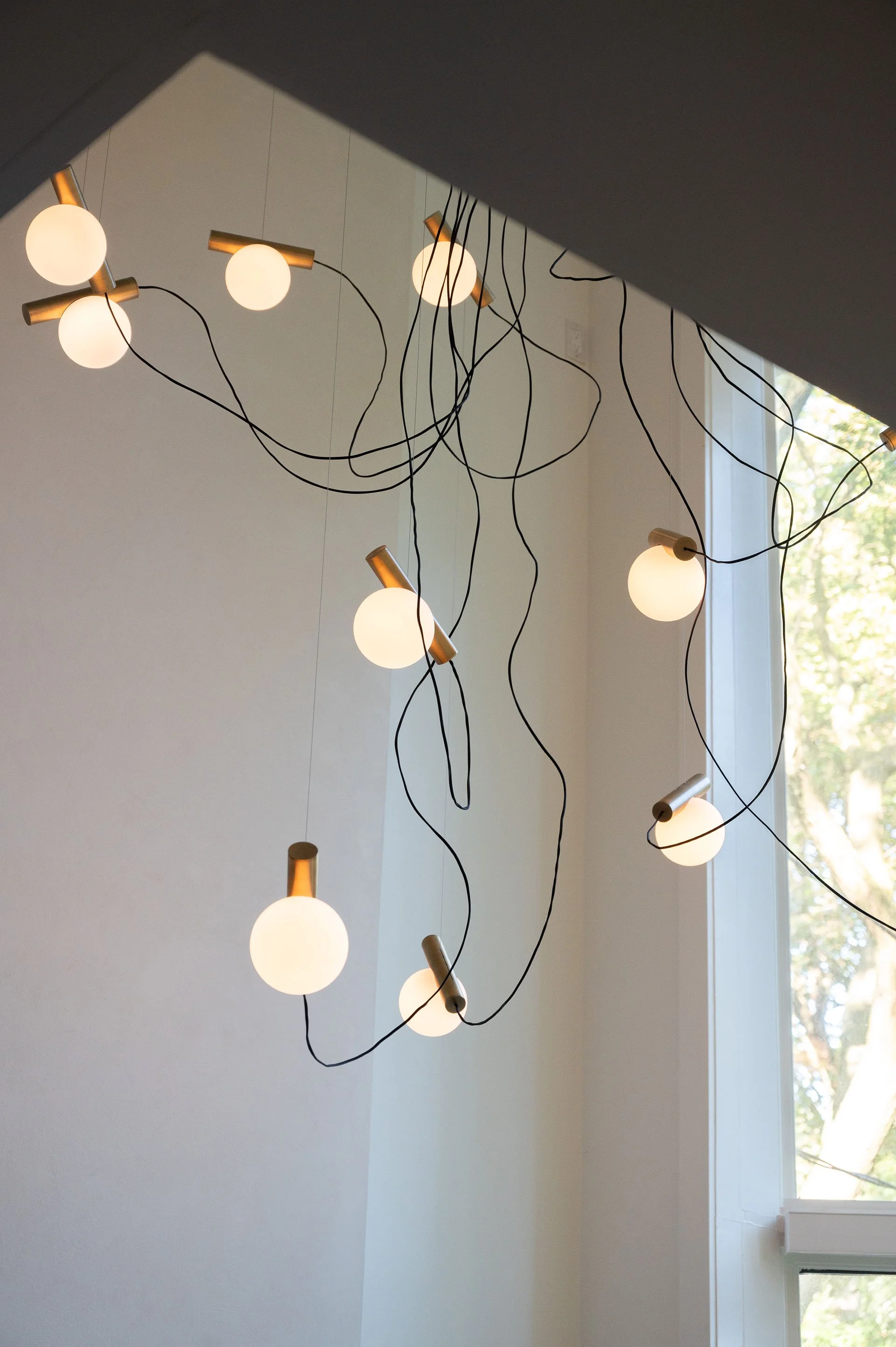
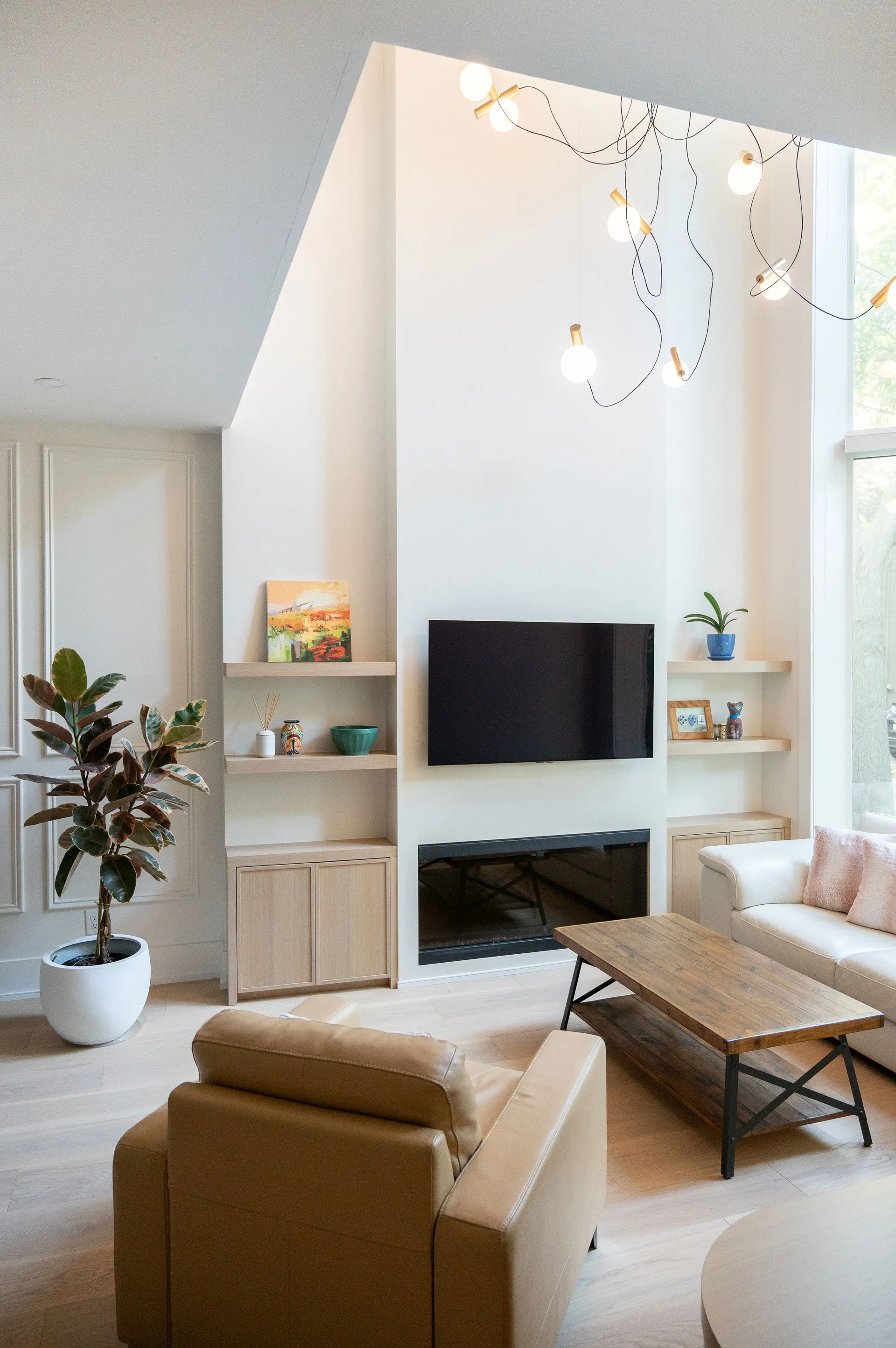
One of the home’s most striking architectural features is the two-story bay window. It floods the space with beautiful natural light and gives us incredible ceiling height to play with. We knew right away that this area needed a statement light, and our client agreed. After exploring several options, we landed on the Node.13 Chandelier by Anony Lighting. Its design is both unique and delicate, making a statement without feeling dramatic or overdone. The globes appear to float in midair, giving the space a light, airy quality that perfectly reflects the overall design concept of this home.
Because we wanted the light fixture and the two-story windows to remain the focal point of the space, we kept the fireplace millwork clean and minimal. The fireplace surround was framed to extend all the way up to the height of the double-height opening, giving it a more intentional and architectural presence. To subtly define it without competing with the other features, we finished the surface in a limewash tone just a few shades darker than the walls, adding depth and quiet emphasis while keeping the overall look cohesive and soft.

Compact, Composed, Complete
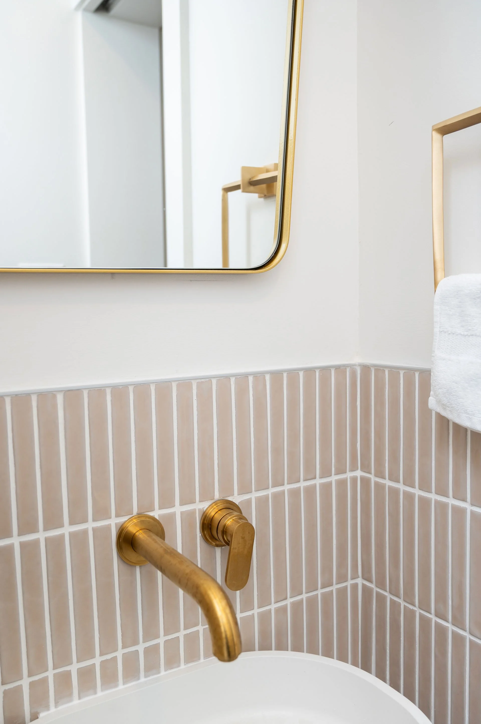
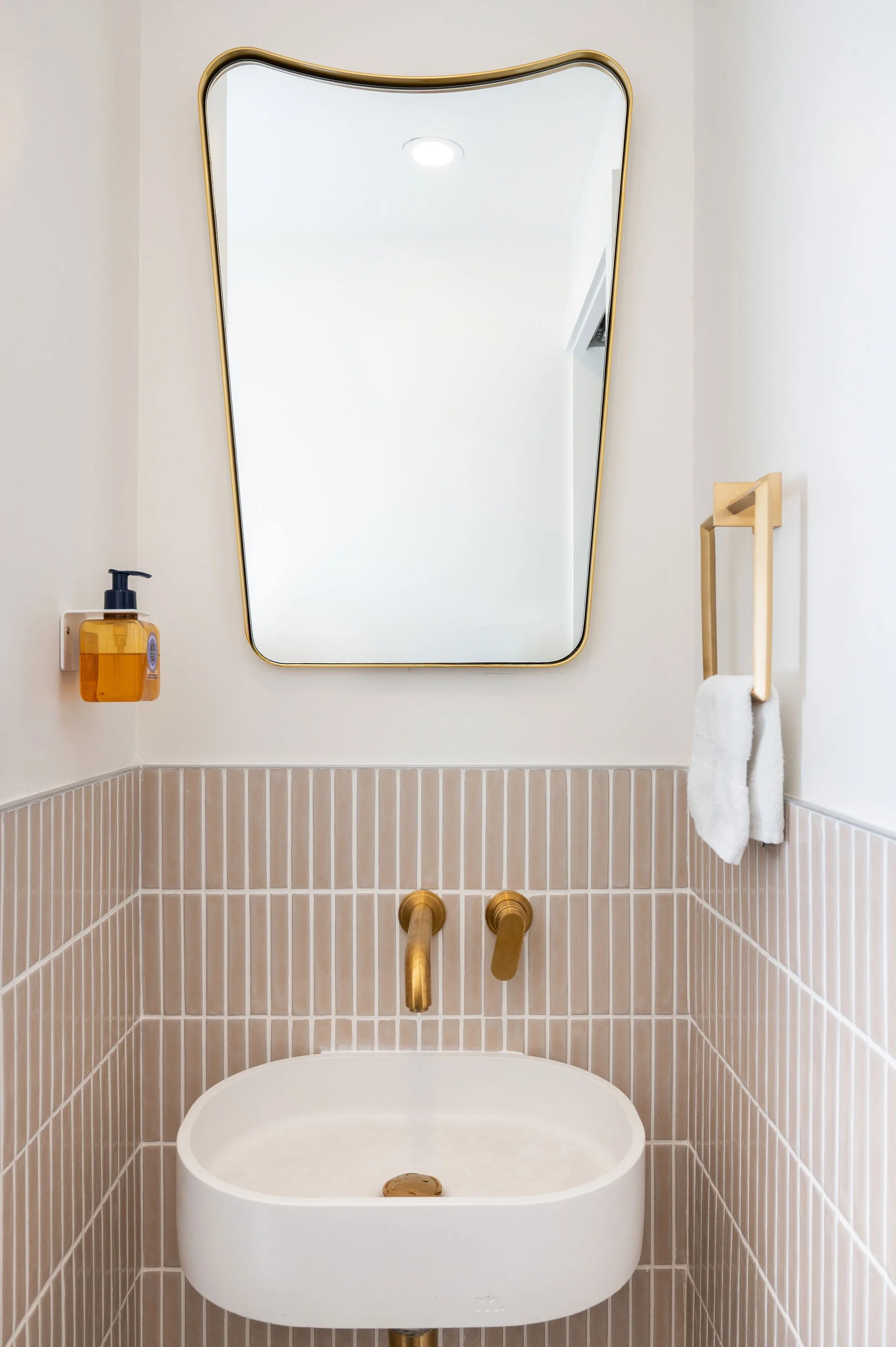
One thing the main floor of this home was missing was a powder room. Guests previously had to go upstairs to use the primary ensuite or down to the basement—so adding one on the main level became a top priority. We placed the new powder room in a natural transition point between the open living area and the kitchen, making it both accessible and discreet.
Because the space is small and windowless, we knew it needed a light, airy palette to keep it from feeling enclosed. We introduced a soft beige kit-kat tile halfway up the wall to bring in subtle texture and visual interest, while carrying over the brass accents used in the kitchen to create a sense of continuity throughout the home. The result is a compact yet thoughtfully detailed space that feels cohesive with the rest of the main floor.
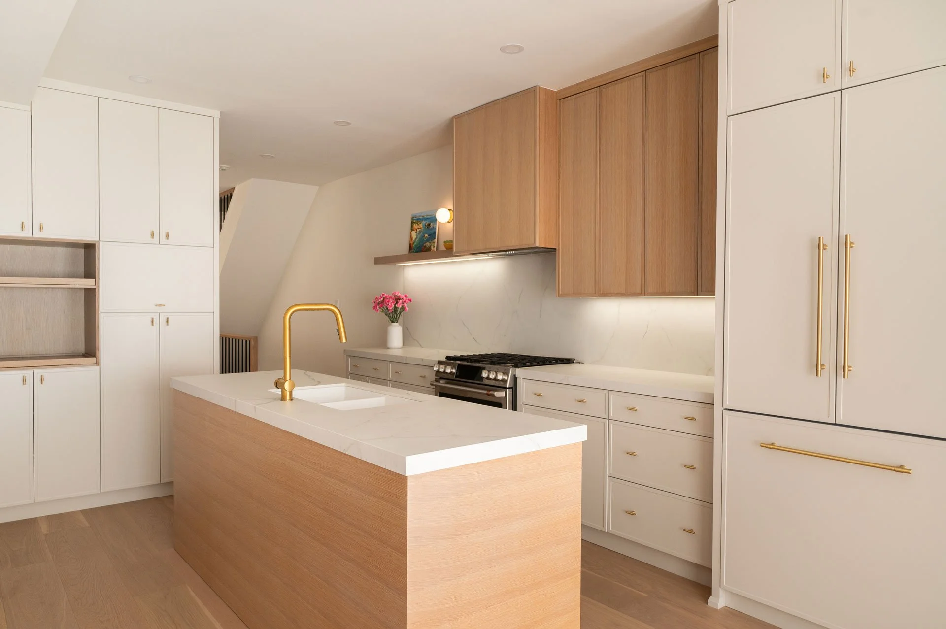
Everyday Elegance
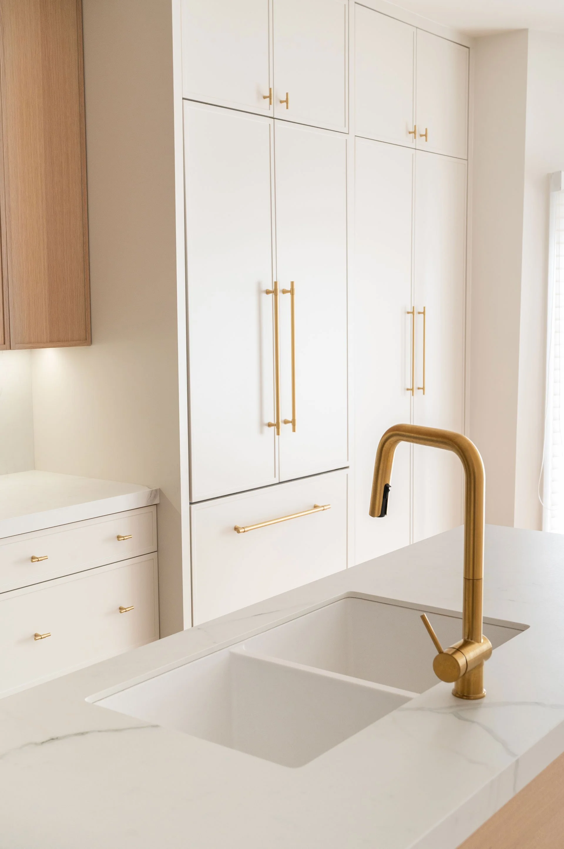
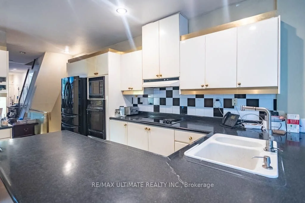
The kitchen was not only outdated but also highly nonfunctional, so we began by understanding how our client actually uses the space, what worked, what didn’t, and what they envisioned for the new design. From there, we completely rethought the layout. We utilized the full length of the kitchen to incorporate much needed storage and a panel ready fridge for a seamless look. Because the room is narrow and has windows along one wall, the opposite side couldn’t accommodate upper cabinets, so we introduced a small island to house the sink and provide additional prep space without crowding the layout.
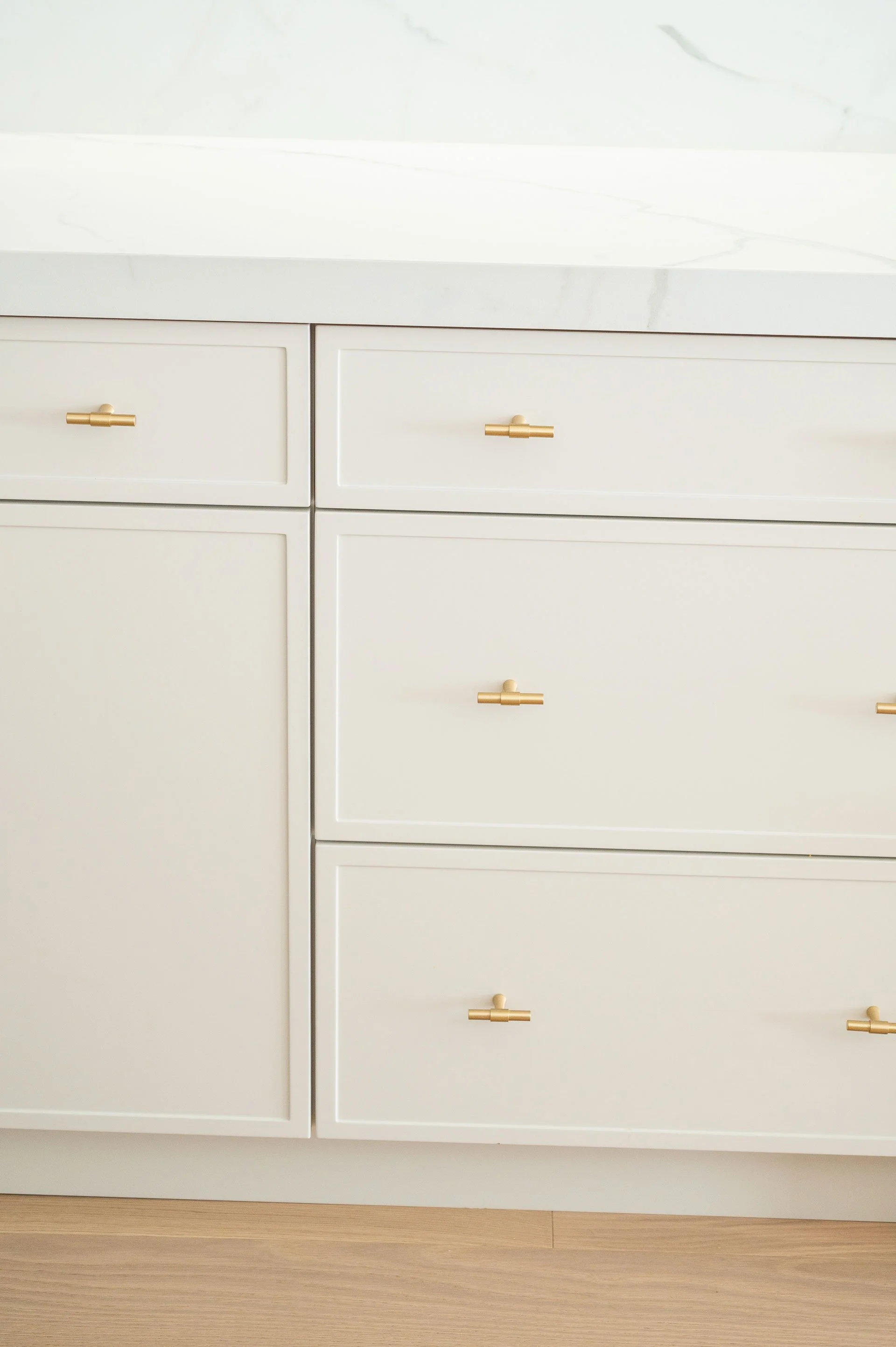
To bring warmth and balance into the design, we went with a two-toned colour scheme: a soft cream paired with light oak. This combination ties back to the millwork in the adjacent living area, creating a cohesive flow between the spaces. We used our favourite cabinet door profile, a slim shaker, on both finishes. It’s a modern and refined interpretation of a traditional shaker, offering just enough detail to add character without feeling heavy. That balance between modern simplicity and subtle charm was exactly what we wanted to achieve in this kitchen.
For the countertops, we knew we wanted to keep things light to complement the overall palette. We selected a porcelain surface from Caesarstone for its durability and heat resistance (two must-haves for our client) along with its beautiful, subtle veining that adds texture and depth. We continued the stone up the wall as a full-height backsplash for a clean, contemporary look. To finish off the space, we chose brass accents. In a kitchen this light and fresh, black hardware would have felt too stark, while chrome or nickel leaned too cool. Brass offered the perfect middle ground, a warm metal that blends seamlessly with the cream tones and wood, adding just the right amount of sophistication.

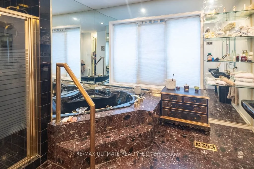
Before & After

Quiet Luxury
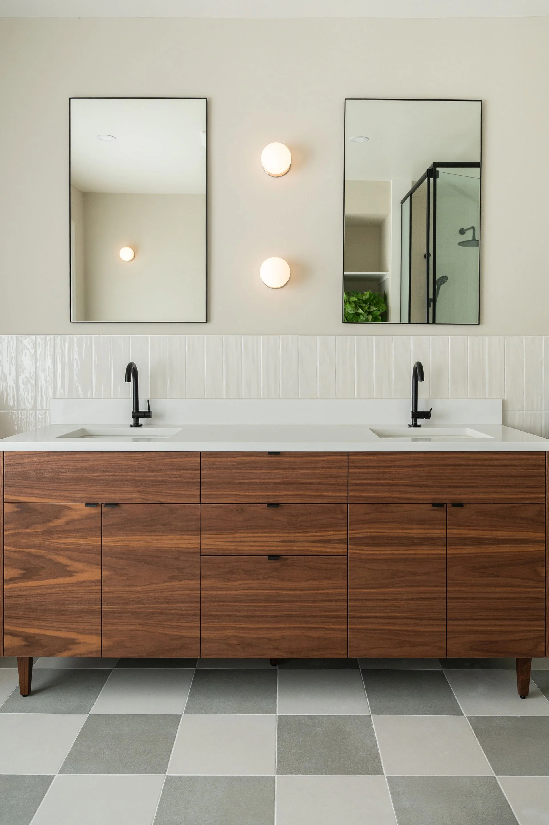
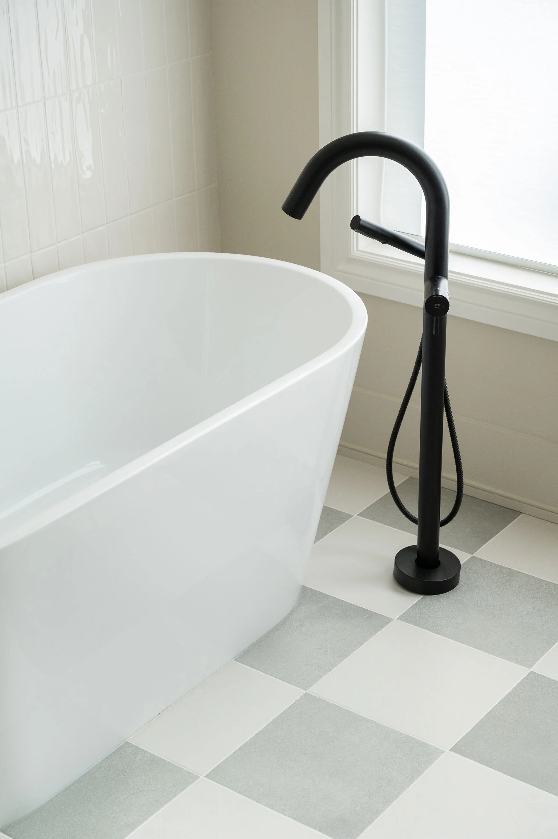
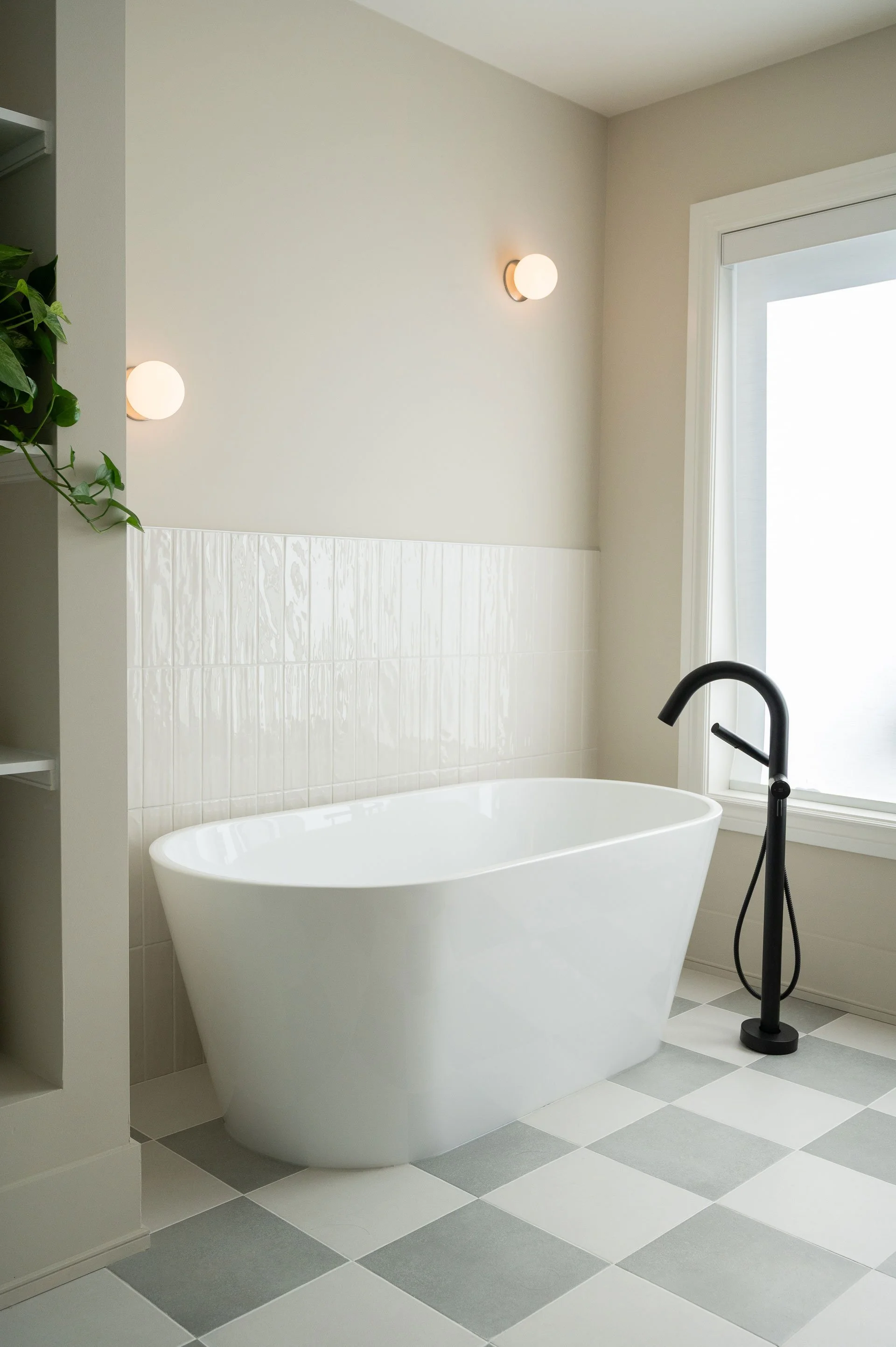
The primary ensuite offered plenty of space to work with, along with abundant natural light from the large south-facing windows. With a freestanding tub, a spacious walk-in shower, and a double-sink vanity with ample storage, this bathroom checked off all of our client’s must-haves. Thoughtful space planning transformed the layout so that, while it occupies the same square footage as before, it feels exponentially more open and luxurious.
For the design direction, we leaned more contemporary than the rest of the home. Given the expansive floor area, we wanted the flooring to make a statement, so we chose a subtle checkered pattern in cream and warm light grey—elegant and sophisticated, rather than bold and stark like a classic black-and-white diner floor. Echoing the powder room, we used vertically stacked tile partway up the walls, but in this space opted for white tile with white grout. This creates a subtle accent, provides the water protection needed, and allows the floor pattern to remain the visual focal point.
To complete the contemporary feel, we introduced matte black accents throughout the space. These details bring a sleek, modern touch that balances the light and airy aesthetic, giving the ensuite a refined, cohesive look that feels both fresh and timeless.
Before & After
This home transformation was all about balance, blending modern freshness with timeless character. Every decision, from the new material palette to the subtle architectural details, was made with intention to create a space that feels open, bright, and inviting while still maintaining warmth and personality. By rethinking how each area functioned and flowed together, we were able to turn a once dark and dated interior into a cohesive home filled with natural light and understated elegance.
The result is a space that feels effortless, modern yet comforting, refined yet livable. It reflects our client’s lifestyle and taste while embodying the Sansa Interiors approach: holistic design, purposeful functionality, and a strong sense of harmony throughout.


Feeling Inspired?
If you're in Toronto or GTA and looking for a full cafe or office interior design, we'd love to design it for you.
Contact us and let our team of interior designers support you.
Sansa Interiors Inc.
Toronto, Canada
info@sansainteriors.com
(647) 556-3137