
Breadsource Bakery & Cafe
Kneaded to Perfection
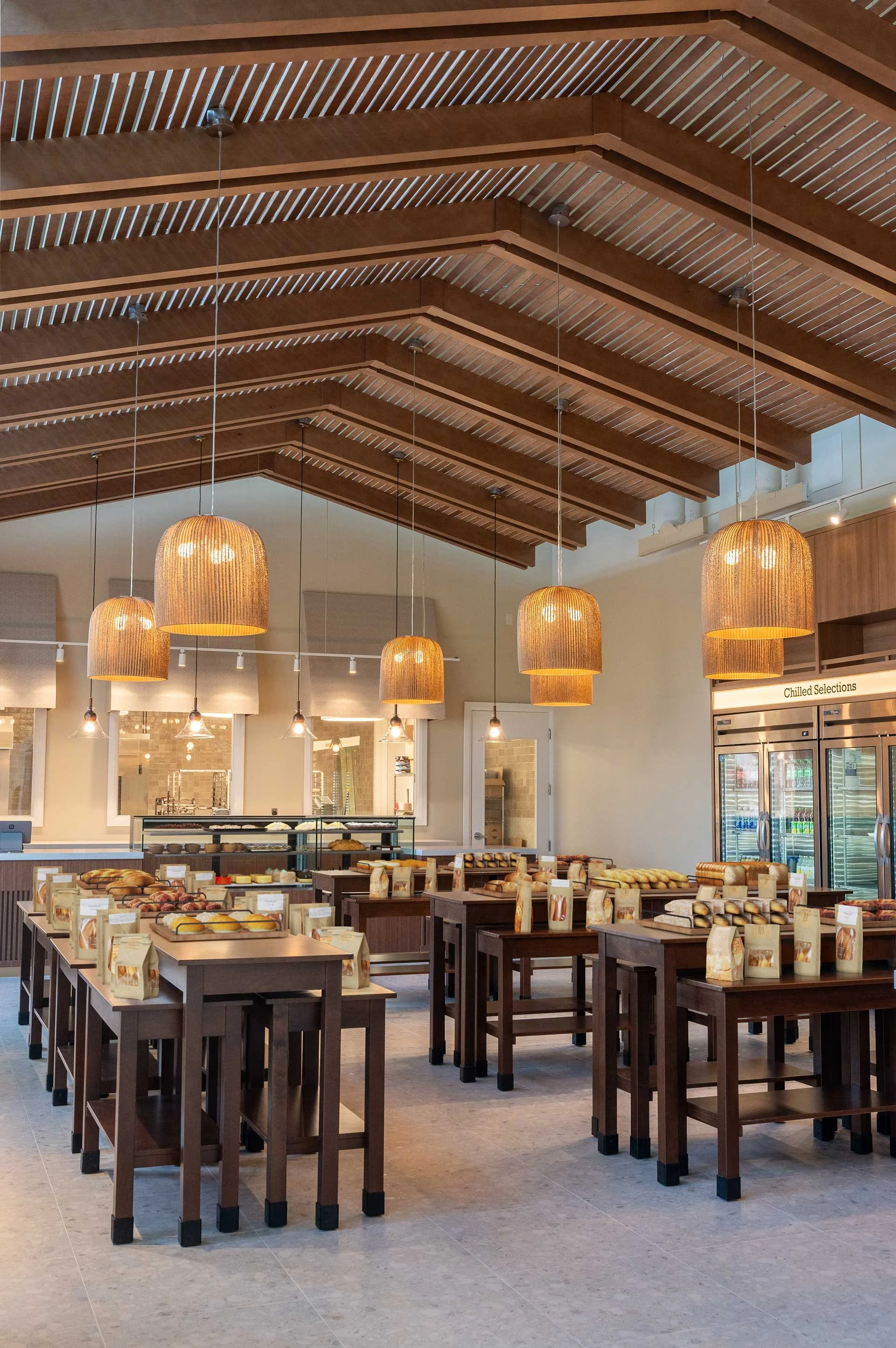
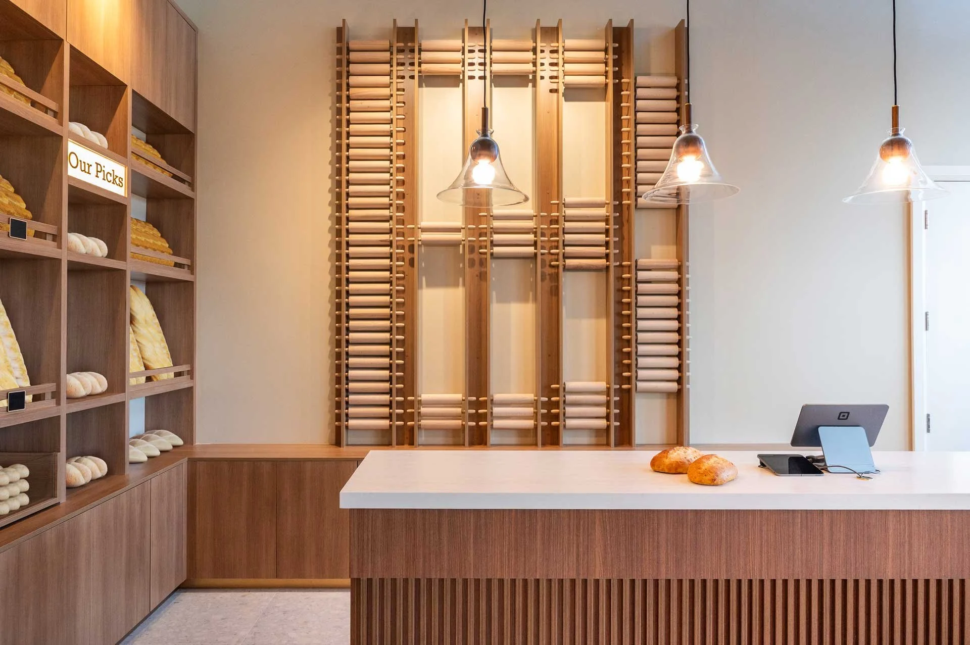
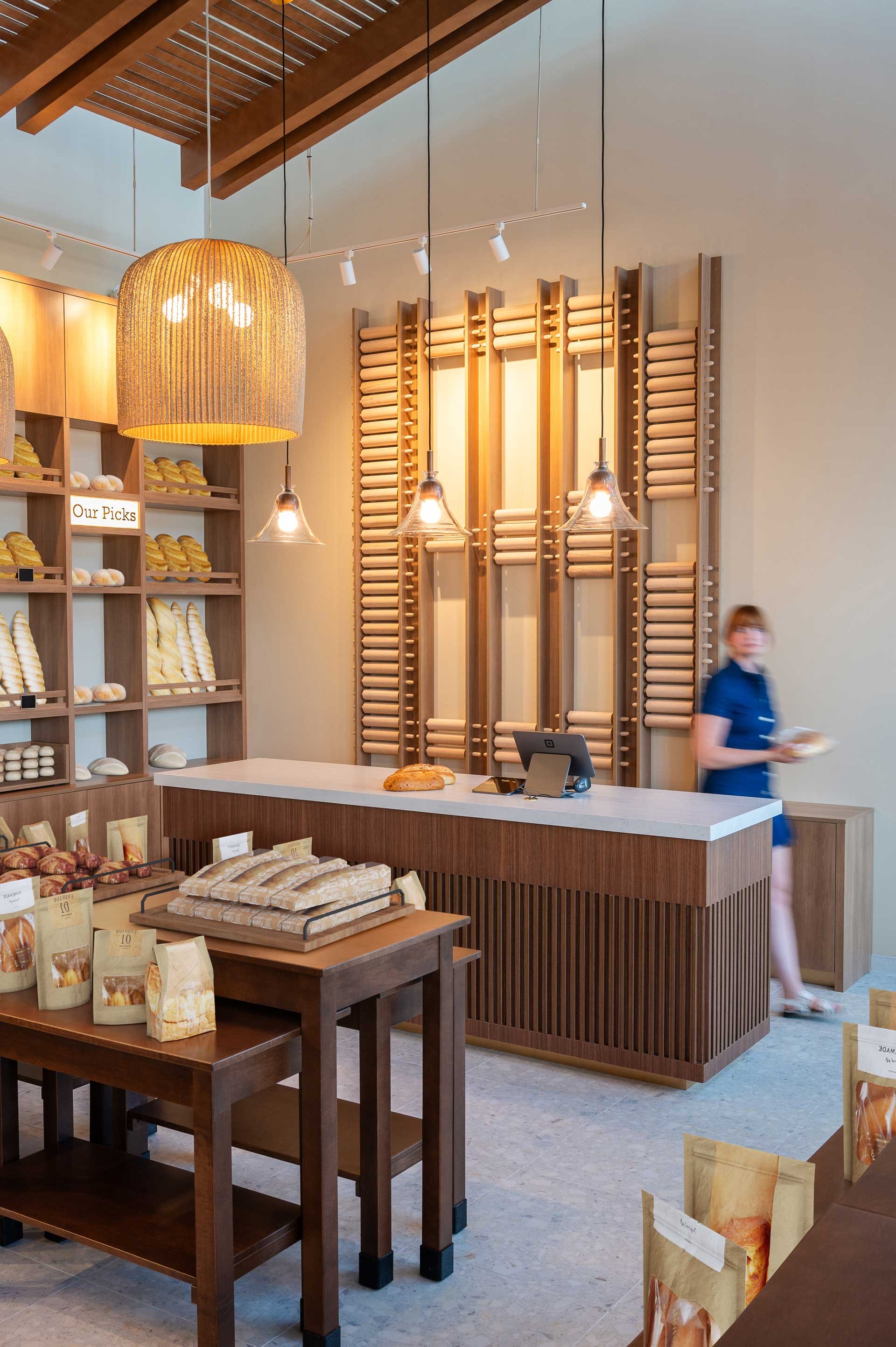
Inviting bakery cafe interior that blends functionality with a warm, branded atmosphere
Located in Scarborough, this cozy, family owned bakery has officially opened their doors to their new retail space. Formerly a wholesale only operation, this family has now brought their delicious baked goods directly to the community. Designed by Sansa Interiors, this space is warm, welcoming, and makes you feel like you are stepping right into a freshly baked load of bread. From the soft textures to the toasty tones, every detail is designed to make you feel like you are a part of the baking process itself
City: Scarborough
Property Size: 1200 sf
Timeline: 9 Months
Budget: $750K
The Design Concept
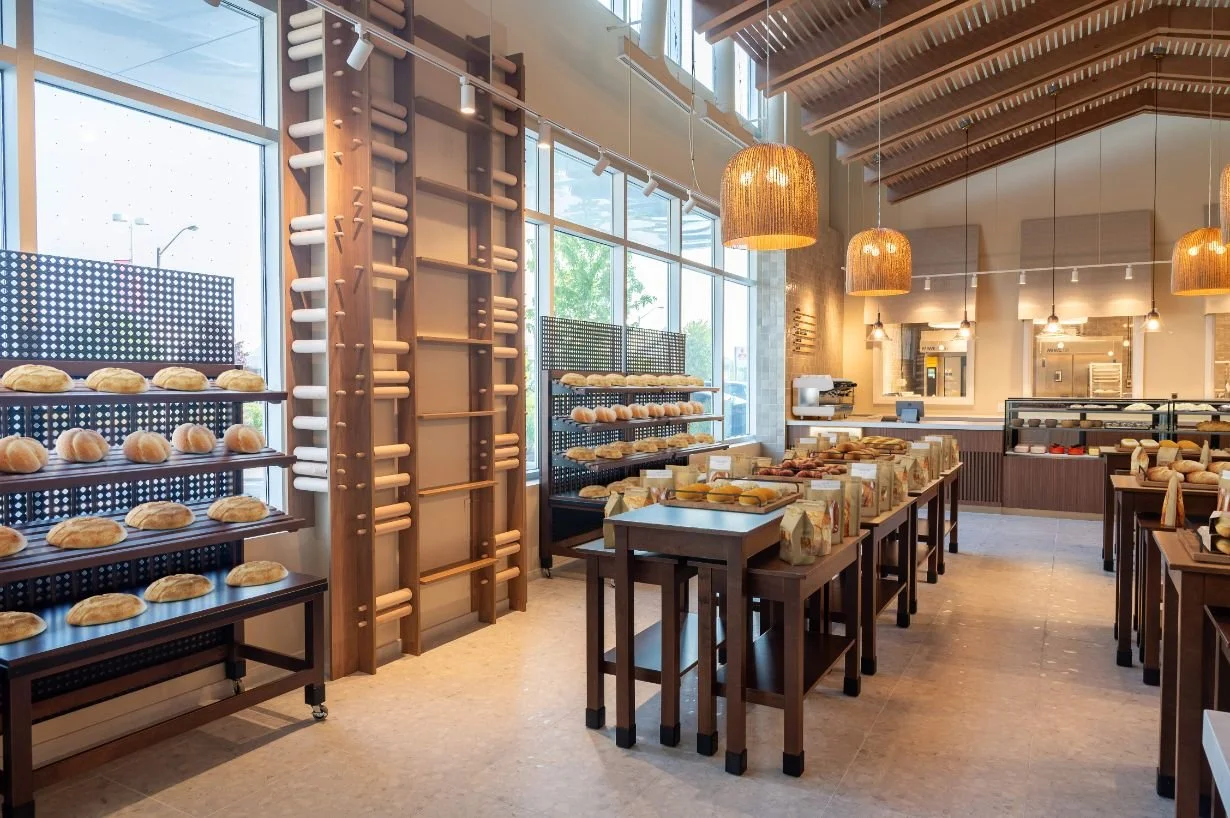
The concept for this bakery was centered around creating an immersive customer experience. From the moment you step through the door to every detail you take in while inside. We wanted the space to not only function well but also feel just as comforting and delightful as the scent of freshly baked bread that greets you when you walk in.
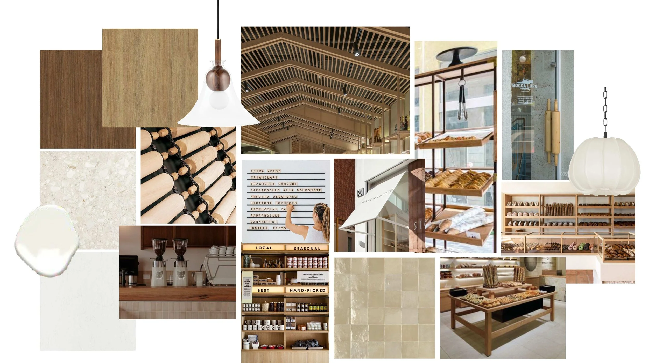
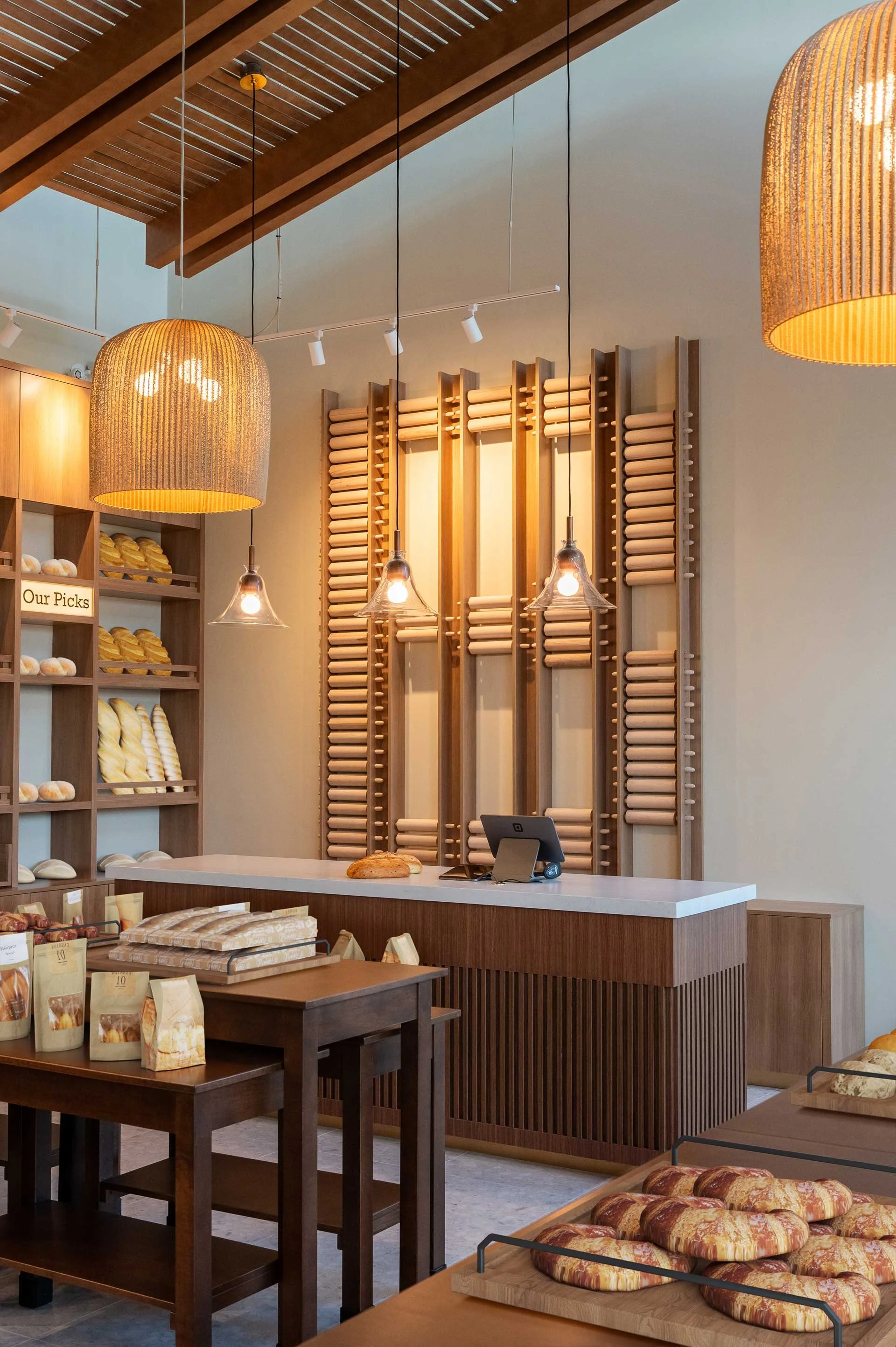
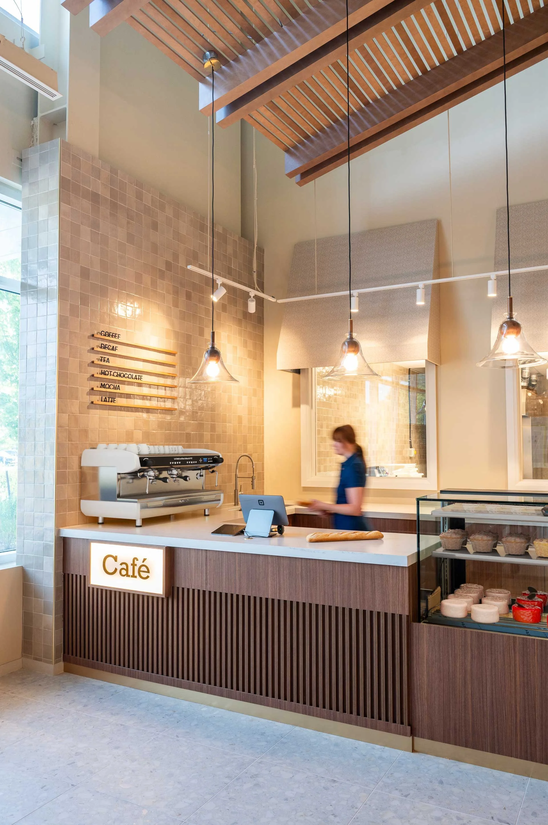
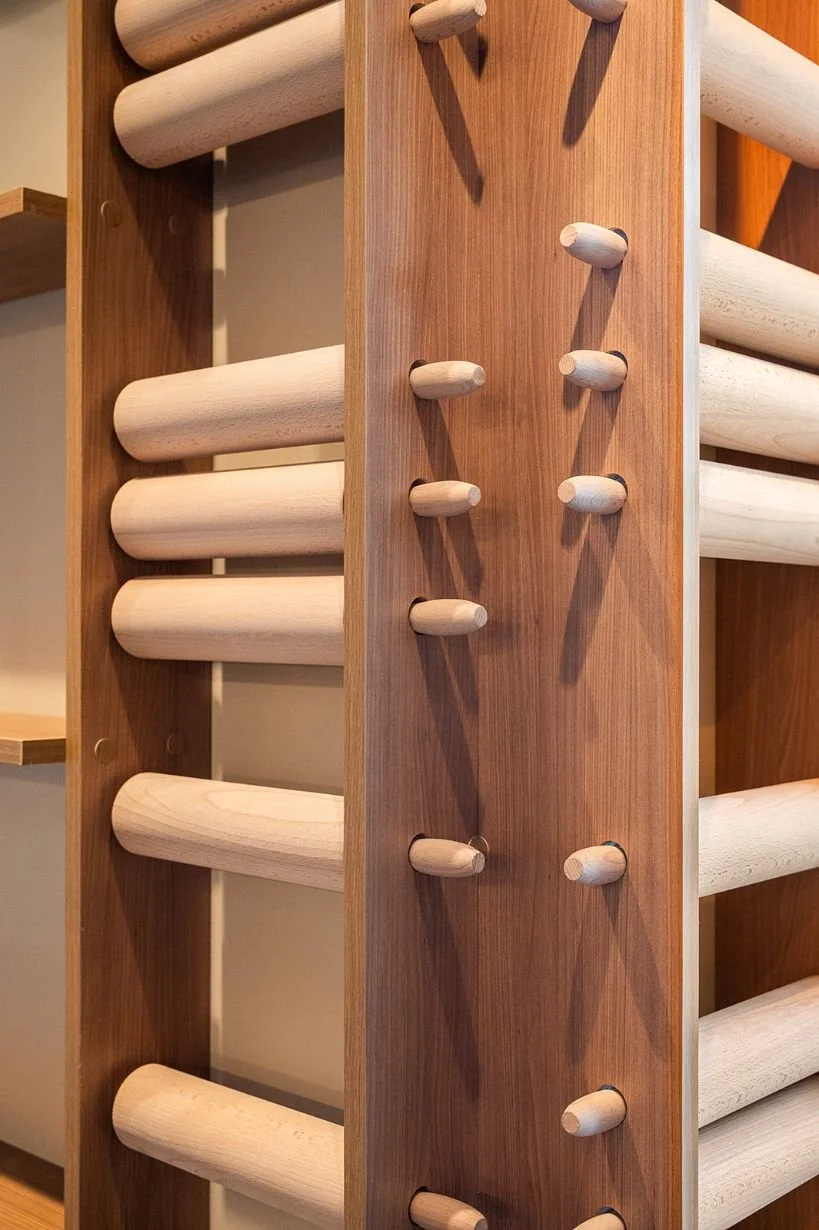
To bring that feeling to life visually, we focused on a warm and layered material palette. We selected two complimentary wood tones that work together to create richness and depth. One being slightly lighter and more subdued, and the other deeper and more refined. By layering these finishes throughout, we introduced subtle contrast and texture while keeping the overall feel cohesive and inviting.
Tile selection played a key role in supporting the overall design direction. We chose a neutral terrazzo tile for the floor. Its subtle pattern gives a nod to scattered bread crumbs and adds visual interest and texture without overwhelming the space. Its durability makes it a practical choice for a busy bakery environment. In the coffee area and kitchen, we incorporated a square zellige tile. Its handcrafted variation brings a soft and organic feel that pairs beautifully with the wood tones, reinforcing the warm, layered, and welcoming ambiance.
The overall design brings through a space that feels both familiar and elevated. Every design choice, from materials to the layout was made with the customer's experience in mind. Wrapping them in a warm, welcoming atmosphere that encourages them to slow down and stay a while.
The Planning
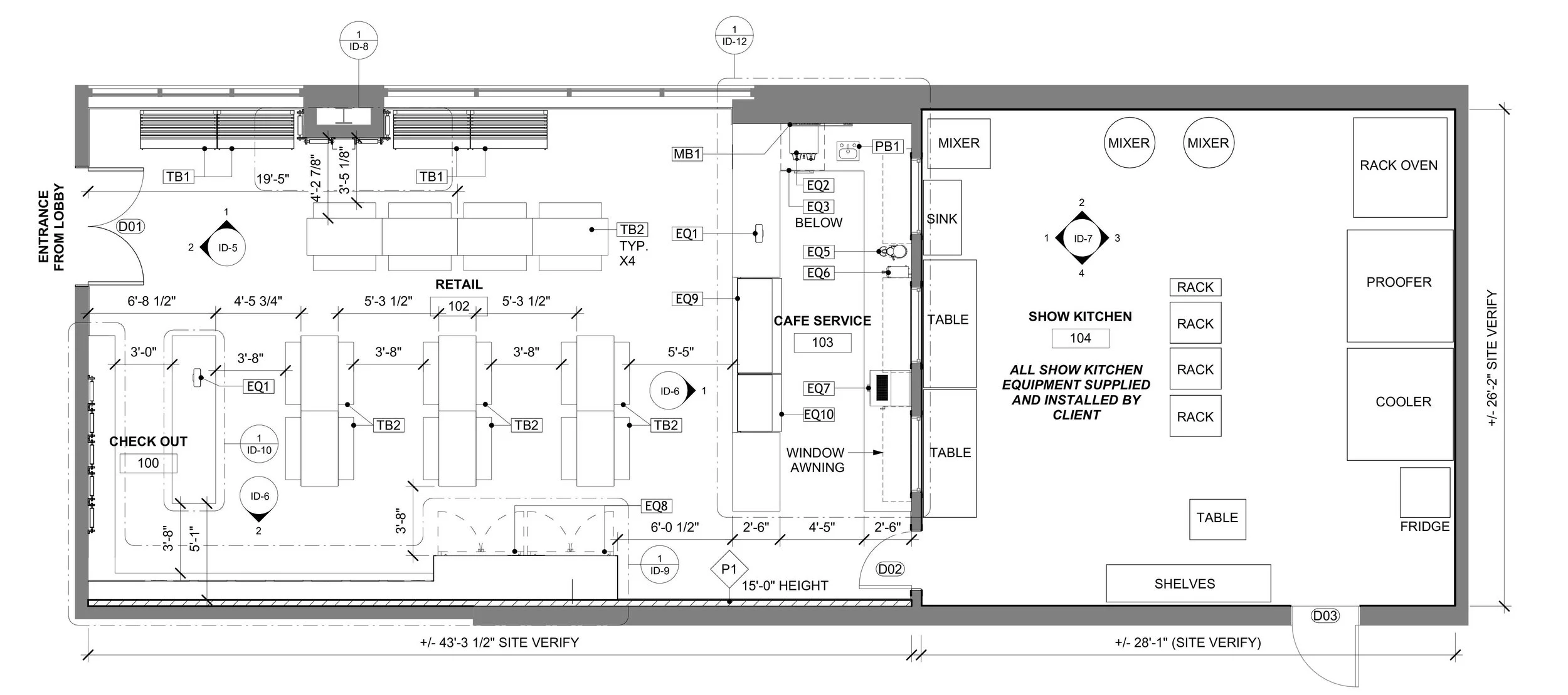
One of the most important parts of designing any space is how one moves through it. From the very beginning of the space planning process, we focused on creating smooth and efficient circulation, for both customers and staff. While it is essential for customers to feel comfortable and welcomed, it is just as critical for staff to move efficiently through their work zones.
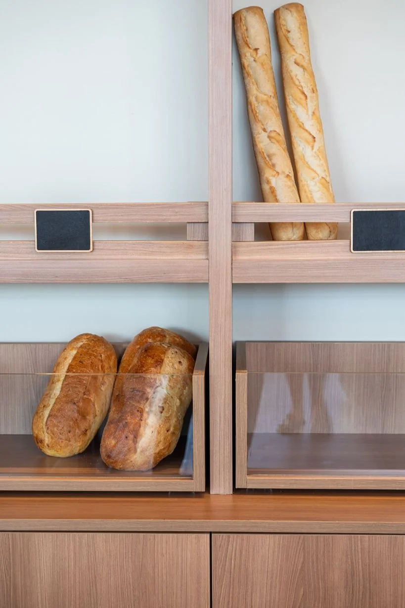
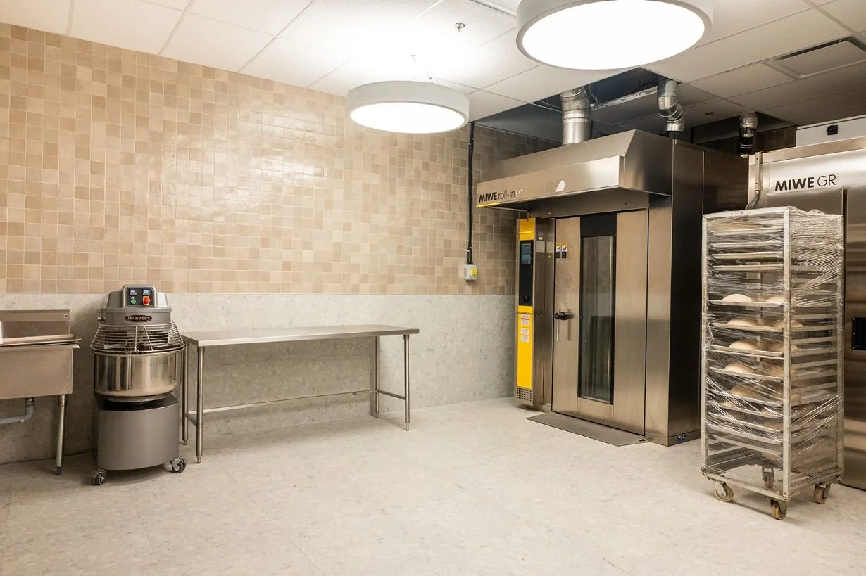
At Breadsource, it’s more than just picking up a loaf of bread and going on your way. They offer in-house bread slicing, packaging services, and freshly brewed coffee. Our layout had to support a variety of activities happening all at once. When we hit the drawing board, we carefully mapped out the flow for both the front and back of house. The bread slicing and packaging station was placed adjacent to the kitchen access for easy handling, while the coffee station was placed on the back wall, right in the customer’s line of sight as they first enter the shop, making it easy to grab a cup while browsing the displays.
We worked hand and hand with this family to ensure that our proposed layout complimented their already established work flow and processes. The end result is a layout that supports the daily rhythm of the Breadsource team while enhancing the customer experience every step of the way.
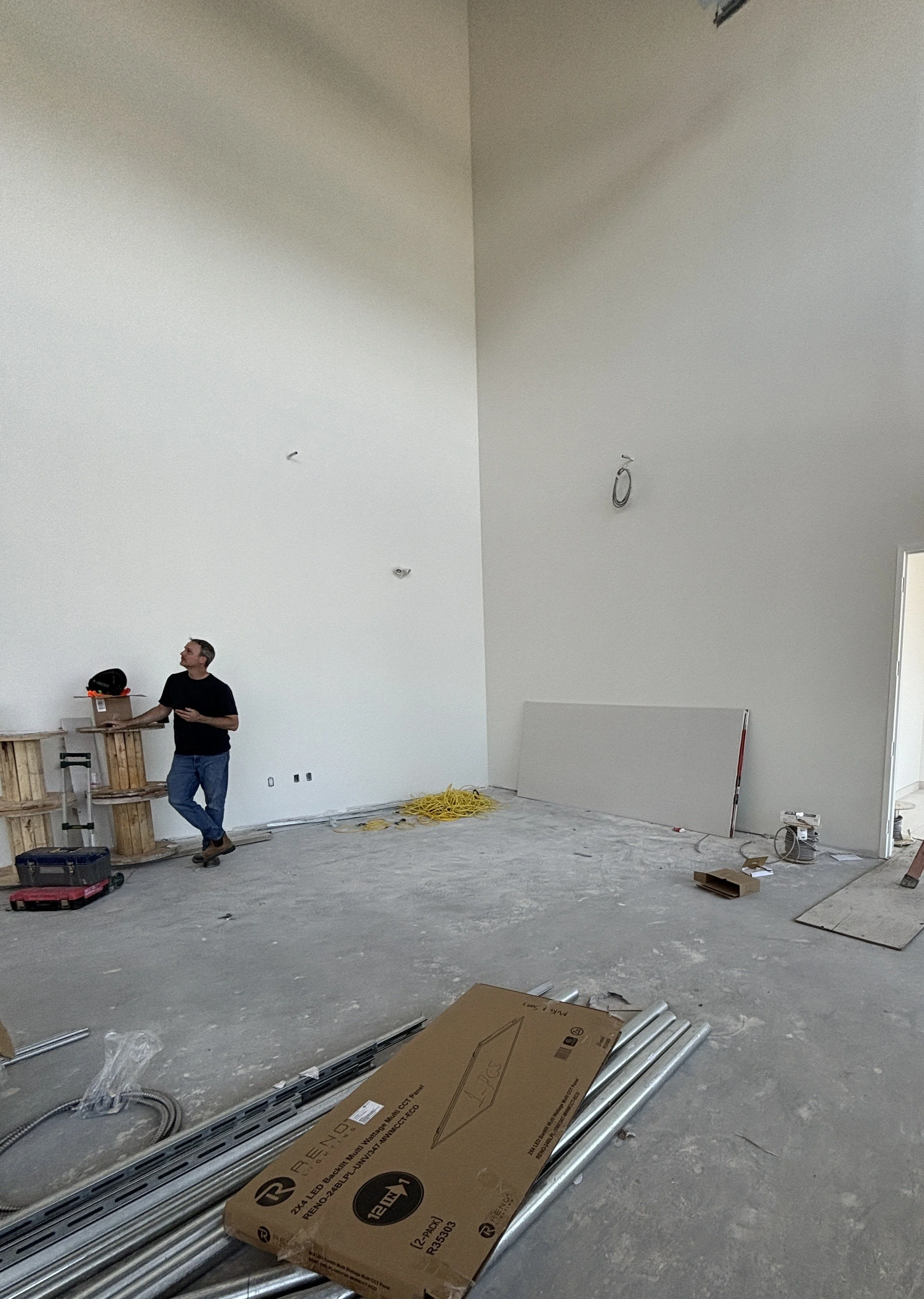
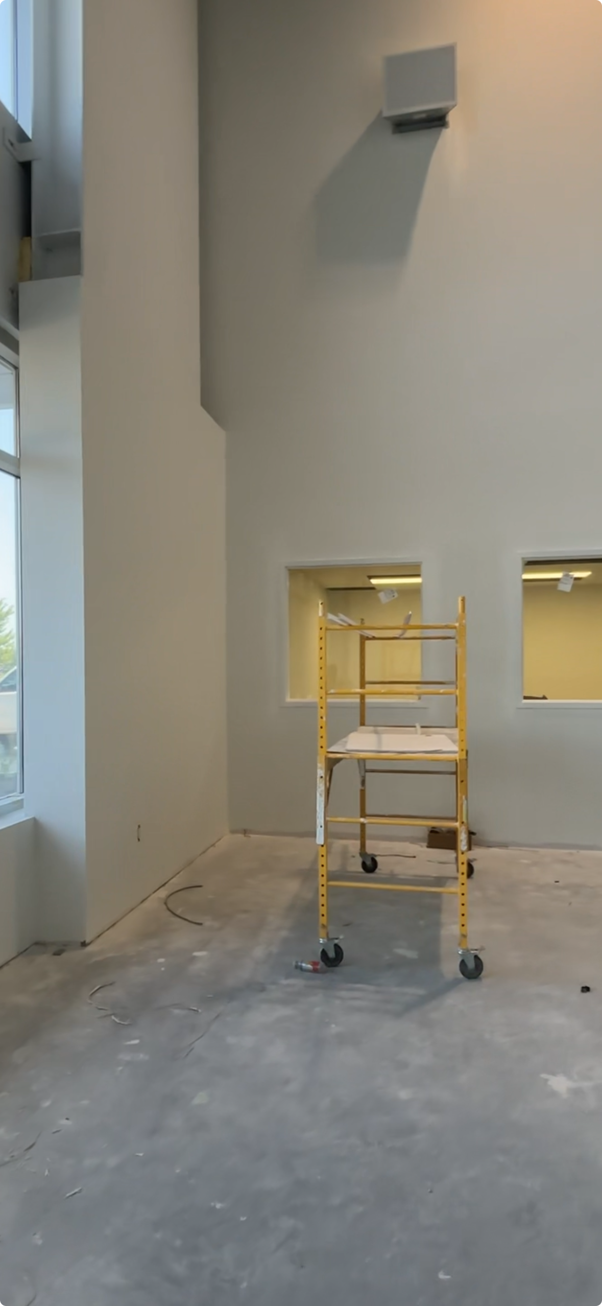
Before & After
From an empty space begging us to add charm, character, and warmth
to an inviting, warm, bakery & cafe packed with rich texture and wood tones
Overcoming Challenges

Baking in the Sun? Not Quite.
One of the challenges we faced was dealing with the full wall of large exterior windows. While they bring in beautiful natural light, they also pose a problem for displaying baked goods, as the items displayed would be in the direct path of sunlight. This wall was prime retail real estate, so forfeiting it wasn’t an option. Instead, we worked closely with the clients to develop a thoughtful solution. First, we all agreed to avoid displaying any items prone to melting, like chocolate croissants, in that area. Then we designed a custom piece that attaches to the back of the retail displays, acting as a subtle sun shield to reduce direct exposure while still allowing light to filter thought into the space. This approach lets us make the most of the window wall without compromising the quality or appearance of the baked goods on display.
Bigger isn’t always better
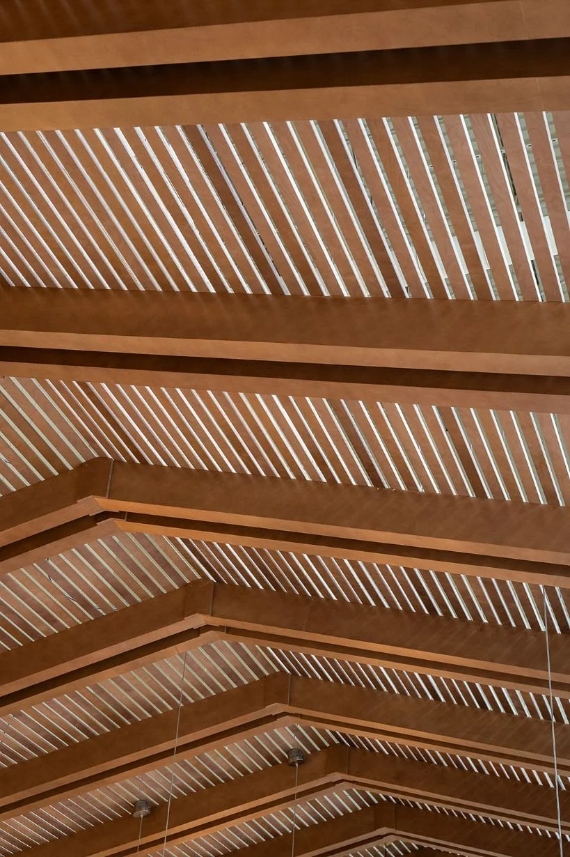
Our second challenge was the ceiling height. Since the space was originally part of a warehouse, the ceilings were unusually tall for a space this size. While lofty ceilings can sometimes add to the ambiance of space, it risked making the space feel cold and empty (the exact opposite of the warm and welcoming space we were aiming for). To solve this, we designed a large custom canopy that visually lowers the ceiling height and anchors the space. This feature helps create a sense of intimacy and cozies, making the bakery feel more connected and comfortable for their customers.
No Time To Waste
Another key challenge we had to navigate was the timeline. The clients had a firm move-out date from their previous space, which meant there was little room for delays. Every decision, from design to construction, had to support a quick turn around. To keep things on track, we focused on specifying from Canadian companies with low lead time products, ensuring availability wouldn’t become a bottleneck. We also collaborated with trades who could work within the project’s accelerated schedule without compromising quality. To be transparent, there were a few minor delays along the way, but by working closely with the contractor, we were able to find quick, effective solutions that kept the project moving forward. It required extra coordination and planning, but it allowed the bakery to enter the space as soon as possible

Photography: Luke Cleland
The Build
Since the unit was in a shell state, the project had a clean starting point. No demolition, no surprises, just a blank canvas. This allowed the contractor to jump straight into construction, which helped us make the most out of the tight timeline. The build itself was essentially split into two major components: construction and millwork. With so much on the final design hindering on custom millwork elements, coordination between the contractor and millworker was critical. They worked closely together to align schedules, manage deliveries, and ensure everything was installed in the right sequence. All of this had to happen while Breadsource's factory (located in the same building) was in full operation. It was important to keep noise and disruptions to a minimum, and the team did a great job ensuring the build did not interfere with the ongoing production next door.
The End Results


Feeling Inspired?
If you're in Toronto or GTA and looking for a full cafe or office interior design, we'd love to design it for you.
Contact us and let our team of interior designers support you.
Sansa Interiors Inc.
Toronto, Canada
info@sansainteriors.com
(647) 556-3137